Openbravo's User Experience Lab
GUI design, ERP Usability and Visual Design

My Openbravo: The First Version

Thursday, May 6, 2010

We are now looking at the first tab in the Openbravo ERP 3.0 GUI. It will contain a My Openbravo workspace. This should contain a set of portlets/widgets displaying metrics, links, applications or charts. Think of a portal similar to iGoogle, NetVibes and My Yahoo! where the user can decide what to show.

Have a look at the My Openbravo page and a version that shows how to edit.

It should work roughly as follows:


  • Left column is filled with links to recent documents and views. Clicking them opens a new tab and takes the user there. Recent views also have Create New links.
  • Below that we see two links that let you add widgets. The link Add Library Widget most likely opens a listbox with the available widgets. The link Add Feed Widget opens a dialog where the user enters a URL pointing at an RSS feed.
  • What´s in the widget is not really the important point now, but I have created some examples that you can find in the presentation mentioned below.
  • In the widget header there are two buttons: maximize and edit. Edit will pop out a little green menu that shows a number of options to move, edit and delete the widget. The first menu option Edit this widget will invoke the bigger green panel (as shown in the Invoiced widget) where attributes can be modified. In this case the user can set the time range.
  • Consultants should be able to create (or modify) widgets where grids are shown with a number of columns/attributes, possibly cheered up by a graph. The consultant then also determines which attributes can be set (when the user clicks edit).

As a first set, I would propose to produce at least one grid-chart widget, an RSS feed widget, alerts and saved searches.

Find a more elaborate PDF presentation and leave your feedback here.

Bed Time for the Click and Scroll Myths

Friday, April 30, 2010

In site or application design, it is recommended to use best practices, rules-of-thumb and proven principles. User experience specialists validate most of their ideas and designs using those. In case they can't find any, they mostly resort to usability testing, trying to prove that something works or not.

Over the years, some of the rules-of-thumb have seeped through to the broader audience and are now widely used and abused. Some classic examples are: "Flash is Bad", "Frames Suck", "People don’t scroll!” and the most obstinate of them all must be "I should be able to find everything on a site in just three-clicks!".

The first two claims at least can be defended with reasoning and by the simple fact that Jakob Nielsen´s words are not to be disputed. The claims that user don´t scroll and that every page must be reached within three clicks are myths. There is no scientific proof or sound reasoning behind them.

In the case of scrolling, some 15 years ago many first time web users had to get used to content being spread out over a larger vertical area that needed scrolling to be viewed. Now, in 2010, it is not hard to assume that people learned how to use a mouse. Obviously, for advertising, being above the fold makes sense as more people will see your ad when landing on the page (where else are they going to look?). In the context of user tasks, users are willing to scroll, although they say they don't. Even Jakob Nielsen succumbed in 1997 and wrote that scrolling is now allowed.

My favorite myth is the Three-Click-Rule. In countless discussions with clients, management and developers I have heard this "argument" being used. I confess that I even shamelessly used it against others when it served me well. I have always kept my mouth shut when The Myth was used against me when designing e-commerce sites because it always made sort of sense to me to get that 12-piece knife set in gift wrapping as soon as possible in the basket and checked out before the customer changes her mind. And even in this case research has shown that The Myth does not hold true. User Interface Engineering (UIE) conducted an analysis showing that there wasn't any more likelihood of a user quitting their purchase process after three clicks than after 12 clicks. In the same analysis we can find that user satisfaction does not suffer with more clicks either: Fewer clicks do not make more satisfied users.

So, user frustration and success rates in task completion do not depend on the number of clicks. Nor do they rely on not having to scroll. What really matters is that users can find what they are looking for, which depends on many factors such as flow, layout, interaction and visual design. If users find what they are looking for in a logical (and therefore effortlessly reproducible & memorizable) manner, both success rates in task-completion and user satisfaction will be higher.

Most - if not all - of the research on these topics was conducted on web sites rather than applications but I suspect little difference in its applicability. In the case of business applications, such as ERP software, we need to be a little bit more careful because of the factor productivity. Productivity is output per unit which in most cases can be captured as work per time unit. This is where speed comes in. In our case, the speed of operation of the user is very important. It depends on the response time of the system and the user interface. The first is a purely technical matter; the second depends on the GUI design. I believe that the number of clicks and the amount of scrolling has little impact on the user productivity as long as the user has easy access to all information that is needed for the task at hand and all steps in the task flow are logical, predictable and reversible. Also: providing defaults, offering validation, saving preferences and supporting different modes of seeking information boosts user´s productivity.

If we look at an example of creating a sales order: Most of the time spent executing this task is spent on finding documents and entering and validating field values, either for headers or lines and in grids or forms. The time spent on clicking and scrolling is negligible compared to that. Making sure the user finds the right documents, processes, forms and fields and making sure that she performs the process steps in the right order without making mistakes is much more important.

Another great productivity enhancer is using keyboard shortcuts. Here the same applies: the amount of key presses is not very important, the underlying logic is.

There is nothing negative to be said against trying to minimize the amount of mouse clicking or scrolling, it even helps designers rethink their solutions and simplify process steps. They just should not be used as a rule or best practice. Let´s put these click and scroll myths to bed and start focusing on good design.

Photo courtesy of Thad Zajdowicz

Test Drive the new Selector

Monday, February 15, 2010

Selecting an object such as a business partner or a product "on the fly" while editing a form is a frequent task. In the current ERP we support this by providing a UI Selector that lets you choose the object using filters in a popup. The solution we have used so far is very powerful but not very usable. Clearing filters is awkward and it does not support suggestions or any other assistance in speeding up the filtering process.

With the new UI Selector we believe these problems will be past tense. Using SmartClient technology we have built a UI Selector that makes use of suggestions (using live filtering) and applies column filtering in the grid.

We have created a test instance where you can play with the new selector.

Go to http://79.125.36.179/openbravo/security/Menu.html

Log in with selector/test

Navigate to Sales Management > Transactions > Sales Order. The business partner and product selector have been enabled for the sales order header and line.

You can use the following keyboard shortcuts:

Ctrl-enter opens the popup /layer
Alt-arrow-down opens the suggestion dropdown

The new selector can be defined without programming. The definition is done in the application dictionary similar to windows and tabs. Selectors can be changed at runtime by a consultant without re-starting the system or re-compiling.

We intend to initially publish this as a commercial module and later open it up to the whole community as part of Openbravo ERP 3.0.

Let us know your findings on the UX Lab.

A Christmas Carol: Advanced Payables and Receivables Management Redesigns

Tuesday, November 24, 2009

In the novel A Christmas Carol by Charles Dickens, clerk Bob Cratchit famously spent his Christmas eve doing the final 'bank reconciliation' for his employer, Ebenezer Scrooge. Only when reconciliation was complete he was allowed to go home for Christmas dinner with his family. Nowadays bank reconciliation isn't such a punishment anymore thanks to accounting and ERP software but there is still a lot to improve. Too late for Bob now but for all other incumbent financial staff among you we have some good news.

We have been working on enhancing the user experience in Customer Payment (AR), Supplier Payment (AP) and Financial Account Management, including a full reconciliation process. We now want to validate our designs with you to make sure we are on the right track.

So make life better for all Bobs out there and have a look at our videos and give your feedback on the User Experience Lab forum

Happy Christmas in advance!

Rob Goris - User Experience Architect, Openbravo S.L.

The Family Grid

Thursday, August 27, 2009


A concept that combines parents & children, column filtering, aggregation and table joining, allowing the user to freely manipulate and analyze data

Data is stored in Openbravo in a header-line relationship, also known as a parent-child relationship. For example a business partner who has two bank accounts and two locations. This data model consistently separates parent and child records which makes it suitable for 1:n relationships where there are few parent records and many child records. It will be less suitable for 1:1 or 1:n relationships where n is small. The user can only work in one view at a time and needs to switch back and forth between parent and children frequently.

The next generation of Openbravo ERP aims to offer a more flexible master-detail GUI where parent & child grids or forms can be shown in the same view. This allows for much faster record creation, editing, comparing and searching. Besides that, different views can be opened on separate tabs, offering multi-tasking.

Reports in Openbravo - and most other ERPs - are produced as one-off documents. They have a pre-defined set of dimensions, layout and data grouping. This works fine in most of the cases but in some cases more flexibility is desired.

Pre-defined views make it easy for the user to create out-of-the-box reports and to work on standard tasks but they do not allow the user to freely experiment with the data. Now imagine a grid view where:


  • Parent and child information is combined

  • Both attribute values and records can be shown

  • Column values can be aggregated (e.g. sum, count, average)

  • Complex nested boolean searches across parent and multiple children can be performed on user level by just using column filters

  • Grids can be joined

  • The user can experiment with data in a flexible way. Questions such as "Give me the sum of all unpaid invoices of over 1000 Euros of customers in the Czech Republic that have an HSBC bank account" can easily be answered by manipulation of a grid

  • Most reports can be replaced by this new grid view


The concept that is presented below aims to simplify data by summarizing it, comparable to pivot tables and on the other hand aims to simplify multi-dimensional analytical queries, comparable to on-line analytical processing (OLAP). In the hands of a savvy user, this concept can be a powerful yet easy tool for do-it-yourself business intelligence. For implementation in Openbravo I can imagine that this is an additional view. Not all record types will need it.

I have to admit that I have no idea about potential performance issues. For now I think it is good first to look at whether this idea can make our users more productive, effective and better informed and then assess how to realize it.

This movie presents the idea.

Let me hear your thoughts on the UX Lab forum.

Bank Statement Reconciliation Redesign

Tuesday, August 11, 2009

Bank statement to bank reconciliation is the process for entering and reconciling bank statements with cash transactions from accounts payable and accounts receivable and cash balances in the general ledger. This sounds like a terrible thing to do on a daily basis but it doesn't have to be. We had a look at how to improve this functionality in Openbravo and came up with the following ideas:


  • Introducing an additional layer on top of grid and form views that shows an overview of the bank account, its items that need to be reconciled, some balances and shortcuts

  • Possibility to import a bank statement

  • Automatic matching of bank statement lines with Openbravo transactions. We need to figure out the exact logic here still but value, reference or keywords in the description could be used for automatic match finding. The user then only needs to verify whether the proposed match makes sense, and tick the box.

  • Searching for matches among transactions and invoices. Making a match with an invoice and reconciling means that this invoice will change to status paid.

  • Creating new transactions on the fly when they don't exist yet

  • In case of partial payments we want to be able to match a bank statement line with a part of an invoice. This results in the invoice being paid partially. I call this splitting of the invoice but perhaps this term is not ideal as the invoice remains as a whole but there are just payments made against it.


Have a look at the mockup images and do give your feedback. Thanks!

The Power of Visualization (part II)

Tuesday, July 7, 2009

In Part I of The Power of Visualization I emphasized the need to visualize and how it can help you to be more effective in your work. In this blog post we will look at the tools and methods per activity and object type.

Ideas & Insights


Key point here is that whatever tool you use, make sure it is easy and fast in producing results. Idea generation is all about quantity and divergence and not about details. Pen & paper are ideal. Buy a couple of nice fine liners and markers in different colors and teach yourself some basic sketching techniques to become more effective. Scan or photograph your drawings for reuse in presentations or sharing online. PNG is a good image format for drawings as it combines the strengths of both JPEG (gradients) and GIF (solid fills).

If the ideas yet need to surface, you may want to use visualization tools to create & structure those, together with their associations. Mind maps are commonly used. The benefit over linear lists is that mind maps visualize the ideas in a radial manner which encourages users to diverge and connect ideas. Check out Mindmeister, Bubbl, mind42 and Freemind. The first three are web based, the latter is an opensource Java client application. The image below was produced in Mindmeister.


Design & Development
In this stage you have already filtered out the ideas that won't work and want to add more detail to the few that remain. In most cases this will mean that you need to start drawing wireframes. These are skeleton-style representations of pages, tables, forms etc. that show in low fidelity what elements a page needs to contain and how the interaction works. Esthetics are of less importance here. Making things too pretty can even work against you. Having said that,I have to admit that I am violating the rules of good wireframing sometimes as I tend to add lots of detail and even graphical design in early wireframes. The reason why I do this is that I am a strong believer that you can iterate function and form in the same cycles. The drawback is that you'll need to be skilled in at least basic graphical design and proficient in a tool that allows you to do so (e.g. Photoshop or Illustrator). If this is not the case then this approach will be too elaborate and frustrating. Good looking wireframes can also be misleading for your stakeholders as you'll shift the focus to the looks rather than the functionality of your concepts. You want to discuss functionality in this stage, not looks. The image below shows an example of a typical wireframe, produced in OpenOffic.org. It's great to see how the essence of the idea was preserved in later iterations.


You can also mix existing screen elements (such as a browser frame) with hand drawing.

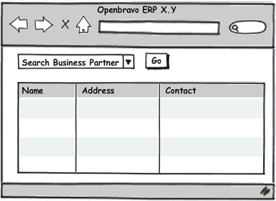
There is a plethora of tools at your disposal for creating wireframes. Powerpoint is great and super simple. Of that same company, there is a product called Visio that I hate but need to mention as it is still the standard in wireframe land. It produces neat wireframes but you can hardly add interactivity and the GUI feels very 1999. I prefer Axure (client install) and a new kid on the block called Balsamiq (web based) that produces very smart looking wireframes (see image below) using a library of pre-sketched components. I have not used Justinmind yet but it is supposed to be a very extensive wireframing / development tool that supports business logic. I recently came across a new web based (Flash) tool called Flairbuilder and like it very much. For Mac the standard is Omnigraffle.


Data
Data visualization is an art and profession in itself but let me point you to a few resources and tricks that you perhaps had not heard of. Books: a classic about data visualization is Edward Tufte's The Visual Display of Quantitative Information. More specific and very relevant for ERP is Information Dashboard Design. It reveals all tricks you need to design state of the art KPI-O-Meters.

Google has made it very easy to create charts via Google Docs. The cool thing is that you can use them elsewhere (blog, web page, portal). Using Google Gadgets, you can even create Hans Rosling style animated charts, of which I was raving in my last post. The Motion Chart gadget uses five dimensions in a single chart and can be fed with your own Google Doc spreadsheet. Below an example I did. It shows sales, profit and order volume per customer over time. Till now you can only use them in iGoogle (hence the screenshot) but I expect that it can soon be used more ubiquitously. Other great visualization tools online are Zoho Reports and IBM's Many Eyes.


Processes
Process modeling or visualization in its essence comprises of labeled boxes and arrows to connect them. Most presentation software does boxes and arrows so for the odd process flow chart you don't have to look further than Powerpoint or its opensource sibling OpenOffice.org's Impress.
For more advanced modeling it is recommended to use dedicated software. Four examples, from simple & cheap to complex & expensive:

Lovely Charts is an easy to use application but it's still suprisingly powerful. You can create flow charts, sitemaps and even basic wireframes. It is web-based and the basic version is free.

We used BizAgi for the modeling of the most common ERP business processes. It uses the Business Process Modeling Notation (BPMN). There is a 30-day trial and it only runs on Windows.

Intalio|Designer is is a good open source alternative to BizAgi. It is built on top of Eclipse.

On the high end of the spectrum there are the modeling tools that are part of a development suite, such as IBM Rational Software Modeler. It uses the Unified Modeling Language (UML) and it does the activity diagram, which is the most suitable UML asset for flow modeling. For most users however, software such as IBM Rational Software Modeler is too complex and too expensive.

Pretty Products & Presentation
This is the toughest one. I want you to create pretty stuff. I want you to pay attention to visual details in everything you do, from writing an email, creating a Powerpoint, to designing a customized entry screen for your client. "I am not a designer" is no excuse really for not doing it. There are plenty of tools out there that make life easy on the visual part but the real difference you make by following a set of basic rules. You can use them all the time since almost all artefacts you create at work are things that will be looked at by a spoiled audience.


  • Audience. This one is too easy but therefore not of less importance: understand your audience and design for them. A presentation for developers should look different than one for marketeers. A toddler prefers other colors than an 80 year old.

  • Images instead of words. Many great presenters use extremely simple slide material with little text and lots of imagery. Photos are used in abundance to capture attention and set the tone, text is used to emphasize what is said. In What Marketers Should Know About Design Research, Ekaterina Khramkova manages to take you through an 88 slides long presentation without ever boring you. In fact, the slides are so clear and enticing that you can easily consume it without the audio. You can do the same. Grab a catchy photo that represents the story you are telling and use some bullets to mark the most important points your are making. Be careful not to use photos that carry copyright. Deviantart and Creative Commons are sites with lots of art work that can be used freely but always check the terms. In case of doubt, just contact the artist and ask for permission. You can also create your own material of course.

  • Layout, typography & consistency. Think about the layout before you begin. Pick a limited palette of colors, pick one (or two) fonts and styles. Choose alignment, where to drop your images and when to use bold. Well, all has been said before but not all is applied by all. When you don't feel comfortable, let your in-house designer or someone in marketing look at what you are doing.

  • Uniqueness. You want people to remember your presentation or product. Surprise, provoke, be unique. Boring is the worst of sins. Pretty is better than ugly and ugly is better than boring. You should check out TED's presentations frequently anyway but this presentation by Seth Godin hits the nail on the head.

Collaboration & Community
Now you want to share all that beauty with the world. You don't want to email your visuals around because that means they will have a life span comparable to door-to-door print advertisment and will fall into oblivium. In case of a design process, you will not be able to document the chronological progress which is crucial in the story telling of how you got to the final solution and why which decisions were made. What is needed is a web-based platform where visual material can be uploaded with ease and viewed by all. Ideally viewers can collaborate by adding comments, annotations and so on. Privacy settings can also be important in case you want to share your work only with a selected group of people.

For the design work of the next generation GUI of Openbravo ERP I have been using Picasa web albums. Annotating is not possible unfortunately and commenting is quite basic but it is rock solid, fast and easy. Flickr offers a similar service. They have added a lot of features lately, including annotations. The drawback of both is that they don't do versioning. A later version of an image will be added to the collection, rather than replacing the previous version. This protects you from cheating with the historical progress tracking but at times it would be great just to be able to replace an image without having to delete the old one and losing its target URL. If you know of any site that does versioning, please let me know.

Both Thinkature and Conceptshare are more advanced visual communication tools that let you collaborate in realtime around a design concept. Jing I use for instant screenshot sharing and Screencast I use for video sharing. It beats Youtube and many other services in video quality because it doesn't resize to a lower resolution.

For webinars the open source hotties are Yugma and DimDim. I have not used it but Glance also received good reviews.

This collection of tools and methods should get you started with visualization. I have opened a thread on Forge for discussions on this topic.