Openbravo's User Experience Lab
GUI design, ERP Usability and Visual Design
Showing posts with label interaction design. Show all posts

Responsive Design For Mobile Retail

Wednesday, March 13, 2013

Openbravo for Retail can now be used on smart phones. This article explains its responsive behaviour and ends with a recommended device strategy.


Although computer devices so far only come with rectangular shaped displays, the wide variety of screen sizes nowadays makes designing software that runs well on different devices a much harder task than a few years ago. Apart from different screen sizes, developers also have to deal with different resolutions, aspect ratios and different operating systems. As for the last factor, fortunately Openbravo for Retail runs in a web browser which makes it platform-independent. This leaves us with the factors screen size, resolution and ratio to worry about.

Screen Sizes, Resolutions and Ratios

Smart phones are getting bigger, tablets are getting smaller and more laptops have touch screens. It is clear that there is a lot of overlap in device categories when only looked at from a specifications point of view. Here is a rough categorization:

  1. Traditional desktop and laptop computers that are operated using a keyboard and a point & click device such as a mouse or trackpad. Screen sizes vary between 11” (e.g. a Macbook Air or Netbook) and a 24” external monitor. Resolutions vary roughly between 1024x640 and 1920x1200 pixels with aspect ratios from a more traditional 16:12 up to a widescreen 16:9 ratio. 
  2. Tablets with touch screens that are operated by fingers or a stylus. These typically measure between 7” and 11”. With the introduction of Windows 8 it is expected to see much larger "tablets" because most Windows 8 laptops will also have a touch screen in addition to a keyboard. However, I believe that every device with a screen larger than 11” is best treated as a traditional computer since it will rarely be used on the go because of its sheer size. Tablets are operated using both hands but can also be placed in a stand and used with one hand or even an external keyboard. 
  3. Smart phones with touch screens that are operated by fingers or a stylus. These typically measure between 3” and 5” with hybrids (“phablets”) up to 6” of display size. Aspect ratios vary between 16/9 (e.g. iPhone 5) and 16/12 (e.g. LG VU II). Mobile phones can be held in one hand while being operated by the other. With a smaller display size or bigger hands, one-hand operation is common. 
To add to the complexity, tablets and mobile phones screens can be used in either portrait or landscape mode.

One, Two and Three Columns 

The best way to deal with such a vast array of screen sizes, resolutions, ratios, orientations and operation modes is to design for mobile first and to apply responsive design. Responsive design is a term that is used for web technology that adapts the rendering of pages depending on the screen space, browser and device used. These are identified by the Javascript framework and the best possible viewing and usage experience is subsequently offered. In practice that means that more components are shown when more space is available or these components are shown in a different, optimized way. Note that in our case this does not imply that you would have less functionality on smaller screens, it is merely a matter of not showing everything at once.

For Openbravo for Retail this works as follows:

Large widescreen monitors will benefit from a three column layout. Besides the ticket and scan/browse/search/edit columns, users will also see an additional workspace column on the left hand side. Note that the third column has not been developed yet but is part of our roadmap for this year.


Medium sized monitors and tablets in landscape mode will be using a two column layout. This is what Openbravo for Retail is currently using.

Smart phones and tablets in portrait mode will work with a single column and depending on the task at hand, the user can switch between the columns by swiping horizontally or tapping a pagination button.


You may wonder why we have put in pagination buttons when you can swipe horizontally. We could have used the precious screen space for something else, right? The answer stems from our design philosophy which assumes that it is unknown which kind of input device people are using. A typical retail point-of-sale setup will use a touch screen but many stores also need a keyboard and mouse to look up products that require keying in long product codes or keywords. It could also be the case that a retailer simply does not want to replace his current monitors with touch screens. Simply stated: Openbravo for Retail and Openbravo Mobile does not want to impose a device or input method.

Device Strategy 

With such a large amount of factors choosing the best device for your context is not easy but with responsive design you will be able to run Openbravo for Retail on most devices if you take into consideration a few guidelines.

First, there is a minimum screen size. This has nothing to do with pixels but has everything to do with basic usability. If things get too small, you simply cannot read text anymore and controls will be hard to target. The minimum screen size for smart phones for Openbravo for Retail is 3.5”.

Second, there is a minimum resolution. The more pixels available, the more information can be shown. The minimum resolution for smart phones for Openbravo for Retail is 480 x 800 pixels.

Third, there is a minimum amount of memory and processing power that the mobile device needs to have to run Openbravo for Retail comfortably. Because everything runs inside a browser, theoretically the browser determines the need for system resources. As a rough baseline, make sure to have 512 MB RAM memory on board and a 1 GHZ processor.

Fourth, there is the need to use an up-to-date browser that is either Chrome, Safari or the Android stock browser.

Complying with the above, the remaining factors for choosing the right device will depend on your users and usage context. Sure, Openbravo for Retail now adapts itself to your device but picking the appropriate device for your users is as important as ever. We strongly recommend to spend some time investigating how Openbravo for Retail is going to be used. Is the device going to be used for client-side selling or as the main POS terminal? Does the device need to fit in a pocket or will it be attached to the wrist? What are the lighting conditions the device is going to be used in? I cannot stress enough the importance of doing contextual research. Observe and interview your users and try different devices before deploying any.

Design Guidance for Openbravo 3

Friday, February 8, 2013


Openbravo's modular architecture makes simple development of extension modules possible. Modularity allows people to develop extensions and to distribute them independently, as well as to leverage distribution channels.  The number of available commercial and non-commercial modules is growing and dissemination of modules is growing alongside. To avoid inconsistency or substandard user experiences, guidance must be given to the community on how to create high quality, usable, enjoyable and consistent modules and customized Openbravo windows. We have created two documents to help you in doing so. The starting point is the User Interface Guidelines wiki document that describes the main rules and tips for Openbravo 3 module and window design. In addition to this, we have built a mockup tool that lets you design Openbravo windows without coding. It is simply a shared presentation document that has templates and library components that lets you design your own windows and flows. Make sure to read the instructions before using it.

Openbravo Mobile: Agile Business at White Valley

Friday, October 5, 2012

After announcing our plans for a mobile solution of Openbravo 3 last year, we decided to first launch the Openbravo for Retail solution with Web POS as the primary mobile interface. Having delivered, we continued working on the core mobile experience. Based on earlier interaction design, we are now in the last stage of completing the Openbravo Mobile platform.

This video shows the power of Openbravo Mobile. It features a lightweight HTML5 GUI that uses Enyo, the state-of-the-art open source development framework. This is an important step towards delivering our mobile vision where all standard windows in Openbravo 3 can be accessed through any mobile device with a web browser. This means full functionality, including record addition and modification, process execution, reporting, notes and attachments.

The featured video demonstrates Openbravo Mobile in different business contexts. Elena´s outdoor store is selling a lot of winter gear due to the cold weather that is coming up. Rob, the sales director, notices this trend while looking at Openbravo Mobile widgets on his phone and directly requests the purchase manager to order additional stock. A few minutes later he receives a notification that the order was placed and he approves, again using his mobile phone. The next morning, the goods are received in the store and Miguel, the warehouse employee, uses Openbravo Mobile on a tablet to register the incoming goods. The circle is closed and business continues.

Openbravo Mobile works seamlessly together with the standard Openbravo 3 browser experience against the same centralized database--further enhancing productivity and accessibility, making your business truly agile.

Openbravo Web POS

Sunday, March 18, 2012

The last month we have been working in stealth mode on the Web Point of Sale (POS) project so you may not be aware of what this is all about. Good things need to be shared and stealth is stupid, so let me give you an update on the latest exciting developments for retail.


What is Openbravo Web POS?

  • Openbravo Web POS is intended for multi-store retail businesses. The solution will be modular, providing a full list of advanced functionality to cover all requirements needed from the point of sale, store management, to the central head quarters.
  • Openbravo Web POS will have an agile, flow oriented, best of breed web user interface oriented to tablets and touch screen systems. The solution aims to provide a highly satisfying staff and customer experience but also needs to be easy to customize and personalize by business partners and end users.
  • Openbravo Web POS is an enterprise level solution that is fully integrated with the ERP using one logical data model. It is also highly scalable and offers web services to expose the enterprise model to the outside world.
  • Openbravo Web POS is an addition to the existing POS client. The choice of deployment options will be left to the business partners and customers.
What have we done so far?

  • The architecture has been decided. Read details here.
  • The main flows and functionality have been designed. Here´s a SlideShare presentation showing the latest iteration.
  • Interactive mockups were built for both desktop and iPad. Download HTML Mockup (unpack zip and run in browser). Download iPad Mockup (you need an app called Presentation Link to run the iPad version).
  • Usability tests were conducted on 12 users using the interactive mockup mentioned above.
  • Based on the findings, we improved weaknesses of earlier versions along the way, resulting in the 8th iteration, which is considered mature. This means that we are now very confident this is going to work for our users.
  • The visual design phase has started. Here's where colors, typography, layout and style are defined. Most POS software is butt ugly and this needs to change. I will share some art work in the next few days.
We're very excited about the Openbravo Web POS. Mind you, this is not your average POS system. This is a retail solution that combines a great web-based user experience with a solid enterprise architecture.

Creating Interactive Mock-ups on iPad

Friday, March 9, 2012

A week ago I started to search for a mock-up tool for tablets. What I wanted to do is to use a set of ready-made page designs and add interactivity to make it come alive. This is business as usual for desktop: I have been doing this for years in tools as simple as Powerpoint or in Dreamweaver by just dropping image maps (linked hotspots) on top of bitmap images. It turned out to be quite hard to find similar tools for tablet and mobile.

The whole point of an interactive mock-up is that it gives the user the impression that they are dealing with a fully functional application. Interactive mock-ups are used to test a much more detailed version of your application design than you would do using wireframes. The difference between mock-ups and wireframes is in the level of maturity. Wireframes are used to communicate the functional flows, the specifications and the layout of an application with very low fidelity. Most designers intentionally draw wireframes in black and white using sketchy lines to make sure their audience understands that everything is still rough. Mock-ups are the next iteration of wireframes. They add more look & feel, interactions, color and graphical elements. Ultimately there is the prototype which is a first real implementation of the design intent. It is developed by engineers and it aims to prove that the technology can do what the designers had in mind.  Here´s an image showing the different stages:


The different stages in application design

Application design comes to life in the mock-up stage and the user - or client - may even think the application was built already. Let me just give you a tip as a side note: Always make sure to communicate that in this stage not a single line of code was written yet and that everything is just smoke & mirrors.

There are plenty of wireframe tools on the market for PC/Mac but also web based applications that do a good job. Here´s an overview of a few years ago that is still valid as things have not changed that much. Good quality wireframe apps for tablets are thinner on the ground and it really gets hard to find a good interactive mock-up builder. Deceptively, most wireframe apps for iPad promise easy image importing but fail on the delivery. Images either have a maximum size, a maximum amount (e.g. ProtoTap) or just can´t deal with full-size rendering in high quality  (e.g. iMockups). Also, when you need to use your mockup for usability testing, you don't want disturbing toolbars that come with the app, as they distract the user who can't distinguish between the controls of your app and the mock-up app. Most mockup tools just don't seem to be designed by designers.

In theory, you could create interactive mockups in HTML (images + hotspots) the same way for tablet as you would do for desktop. The problem however, lies in the playback. The iPad does not allow users to run local html files in the browser, an annoyance of iOS. Android is more flexible but here we run into the second problem: Images are not scaled optimally in the browser which results in nasty slider bars appearing.

So after wasting too many euros on useless - for my purpose - wireframe apps in the App Store (it´s a shame that you can´t return an app if it doesn't do what it says on the tin), I finally found a decent interactive mockup builder app in the business category; a place where I did not expect it. Don´t get fooled by the boring name but mind you: Presentation Link  is quite an exciting find for interaction designers that need to test their work on users. Presentation Link lets you import your images (or PDF presentation) from Dropbox or iTunes. You can then add transparent hotspots on top of these images that turn dead pixels into interactive components. Just draw a rectangle on top of (an image of) a screen element and tell it which slide should appear next when tapping it. By adding enough images that represent different scenarios, you can get very close to the behavior of the final application. Here´s a little demo of Presentation Link:

 
How to create a simple interactive mockup

Presentation Link might actually disappoint tablet users that are looking for a fully fledged presentation maker à la Powerpoint or Keynote but this was obviously not the intention of Zuhanden GMBH, the authors of this tool. Knowing that slick presentations and interaction designs are much better produced on desk/laptop computers, Presentation Link just imports external beauty, links it together in a non-linear way and presents high quality, snappy clickable mockups that can be used for usability testing and demonstrations.

Openbravo Mobile - Idea Phase

Tuesday, November 15, 2011

After the first month working on Openbravo Mobile, here´s a little update in pictures on the progress. At the bottom you will find links to a clickable mockup you can play with. Enjoy and let us know what you think.

First, we had to change our mindset from PC to mobile. My first thought was: "How is Openbravo 3 ever going to fit on a mobile device without losing the great user experience?"

Then we dedicated some weeks to analysis, sketching and playing with phones, pads and every device we could lay our hands on:


It became clear that we had to reduce the PC GUI radically and focus on the basics: Lists and contextual actions. Here´s an example of how a sales person would book an order on an iPad:


We also learned that it is important to offer actionable information. Don´t ask users to go out there and find it but bring it to them! Here´s a director reading updates about his team and commenting on an action:


We realized that mobile ERP is all about browsing, viewing, filtering and applying actions. Now let's see this in action. Here´s a clickable scenario for mobile phones. Here´s a clickable scenario for tablets.


Note that these are just mock-ups without any visual design or coding done yet. In this stage everything is still possible, so don't hesitate to tell us what you think via Google+, Facebook or an old-fashioned email to yours truly (rob.goris at you-know-which-company)

UPDATE: The second iteration for tablet and mobile can be found here and here.

Personalization

Monday, October 31, 2011

Summary: Every industry, company and business process is different. That´s why it is so important that an ERP system can be customized to specific needs. But what about personalization on user level? Here´s how we do it in Openbravo 3.

Openbravo uses a model-driven approach to describe functionality in business rules (rather than code), making it easy to configure and extend. Together with modularity, open source technology and a modern web-based architecture, Openbravo 3 is easy to customize and extend at any point in time.

This is all great stuff but, as often happens with ERP implementations, the end user is often overlooked. As soon as the smart suited implementation consultants have left the building, the real users start entering their sales orders, goods shipments and payments only to realize that the windows they need to complete are not exactly how they wanted it. Maybe the first couple of fields that are shown on the form are not important to the user because the defaults are always the same. Or the order in which to fill out the form is just a bit different than how the implementation consultants had prepared it. Or the default grids show all records so every time again the same filter needs to be applied. All small things that add up and can make a difference in being highly productive or being annoyed.

So how do we solve this? Do we need to call in the guys who implemented the ERP?

The solution is much easier. Openbravo 3 now offers personalization of windows, grids and filters on user, role, client and organizational level. With form & grid personalization plus the ability to save views including filters and layout, users can fine tune their environment. Let´s see how you can use this.

Personalizing Forms 
Launch the Form Builder by clicking the wrench button in the toolbar. On the left hand side you see a list of the available fields for the window. You can drag & drop these fields in the list to change the order in which they appear on the form and set their visibility (of course this is only when a field is not mandatory to fill out). Many forms have different sections and it is recommendable to move less-frequently used forms into the More Information section, so they won´t bother you at first sight. You can also move fields into the status bar area. They will then appear as read-only values on top of the form which is ideal for attributes such as totals or document status.


The preview pane on the right updates with every change, showing you how the real form is going to look like. In the little properties pane on the bottom left you can set the width and the height of the fields. You can also decide here whether the field should start on a new row and whether it will need to have the first focus.

Personalizing Grids 
Grids can be personalized in the following ways:

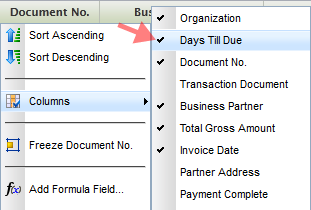
  • Column visibility (right mouse click on column header) 
  • Column order (drag & drop column headers to a new position) 
  • Column widths (drag the borders of the column header) 


These settings are stored on closing the tab. So next time you open a tab of a certain window type you will get the same grid state as how you have left it. This is convenient in many but not all cases. That´s why we now also introduce saving views.


Saving Views 
Saving Views stores grid and form settings, column filters and even the entire layout of the screen, for example the position of the splitterbar between the header and lines. So imagine that you rearranged your grid and it´s perfectly adapted to your task. You even added some column filters, for example you only want to see invoices that are more than 21 days overdue for organization East Coast. Now you save all this in one go using a name. Now when you need to work on another task that needs other filters and grid or form settings, you can easily retrieve this view later.


As well as you let your people adjust their office chair you should let them adjust their ERP to their needs. With Openbravo 3 Personalization this can all be done - without the smart suited consultants. And do not worry if you happen to be one of those consultants: You can also benefit by being able to easily personalize/customize views for your customers and store them on higher aggregation levels.

Test drive personalization on demo.openbravo.com and read more about it in the user manual. RP8RFDV98YUM

Openbravo 3 for Mobile

Friday, September 23, 2011

As a prelude to the roadmap 2011-12 that will be published in the next few days, let me reveal one of the many exciting things we plan to do: A touch/mobile interface for Openbravo 3.


(Credit: US PTO/Apple)


Tablets and smart phones are soon to overtake the role as the preferred device to access the internet. Although enterprise software is typically used in an office environment, this is also changing.

The advantages are clear. A mobile enterprise can benefit from a higher workforce productivity - up to 45% [1], faster decision-making and increased employee satisfaction.

Openbravo 3 has a highly sophisticated architecture where the GUI is defined in metadata. This allows us to easily optimize the GUI for smaller screens and touch interfaces.

Simplification is critical in designing for touch/mobile. Too often mobile apps or sites try to mimic their desktop siblings without looking at the specific opportunities and constraints of mobile devices. We intend not to do the same.

At this point I´m trying to get a grip on which business tasks are essential for mobile. We aim to make all functionality of Openbravo 3 accessible through mobile devices but at the same time we need to make sure that the user experience of the key flows is superb. Let´s focus on what´s important first.

Here are some examples of tasks that could be candidates:

  • A manager approving employee expenses while traveling
  • A sales rep placing an order together with the customer
  • A sales director checking the sales figures before a meeting with his team
  • A CFO checking the financial health of the company in a chart in a widget on his mobile phone
  • A shop owner using her tablet as both a POS and ERP
  • A warehouse person picking orders using his tablet
  • A sales rep being notified that a customer placed an order that cannot be delivered because it is out of stock

Now I´d like to know what would be the typical tasks for your business (or your customer) while away from the desk.

Throw your ideas at us in the comments, via Google+ or Facebook, thanks!

[1] bfrench:"Survey: Mobile Apps Increase Enterprise Performance and Productivity Advantages, Top Three Mobile App Strategies Gain Momentum". iPad CTO. Retrieved 8/11/2011.

Openbravo 3 in Two Minutes

Sunday, September 4, 2011

A super short video that shows why Openbravo 3 is so cool :-)


Quick Pick: a new design pattern for order line reuse

Monday, July 11, 2011

We´re working on a redesign of the Copy Lines & Copy From Order flows. After a few iterations, here is the first draft.


The two scenarios only differ in that one has a preview area and the other does not.

Let me know if this would work for you and your customers. Leave comments below the images in the web album or on the UX Lab forum on Forge.

Lost in The Grid (No More)

Wednesday, July 6, 2011

We noticed that with lots of filtering and scrolling in the grid, you might lose track of your selected row(s). You could scroll up and down to look them up, but this could become tedious when you have hundreds of rows. Sometimes the simplest solutions are the best. Here´s what we did.

So you got this invoice selected in the grid. It is highlighted in orange.


You now decide to filter the grid to look for all "East Coast" invoices that have status "Payment Complete = No".


Ok, cool. We´re done with that and clear the filters. Hang on, where did my selected row go? It must have scrolled outside the visible area.


To get the selected row back in the visible area, we simply click on the selected-row-counter button.


And the selected row moves back in the view port!


Lost-No-More will be available in maintenance pack 1 (Openbravo 3-MP1) due for end of next week.

The Openbravo 3 Design Process

Thursday, June 2, 2011

We´re on the brink of an exciting moment in the ERP space with the publication of Openbravo 3 - Production in a few weeks time. It brings the most radical change in the product´s history.

While the development team is working day and night to make this happen, I would like to share a bit of background information on the design process, context and principles that we applied in this project.

Release Candidates rather than a Big Bang

Big changes carry big risks so at the start we chose to deliver Openbravo 3 in seven subsequent release candidates rather than one big-bang launch. Every release candidate was a working version that customers could try and in every subsequent version the number of bugs decreased and the number of features increased. Releasing this way does not only reduce risk but is also a great way to get early customer feedback, especially being Open Source.

The first release candidate gave birth to multiple tabs, then we added workspace widgets and finally a new master-detail paradigm using redesigned forms, editable grids and split views. With these pillars, our vision for a highly productive, usable and enjoyable ERP system was realized.

From now till the production release we will focus on testing and fixing bugs.

Design Imperatives

A redesign project of such scale and complexity needs to be confined within high level design imperatives. So we started out with stating what Openbravo 3 had to be:

  • Holistic: The solution had to make sense as a whole, not just a set of independent features
  • Relevant: The solution had to make sense to our users by making work more productive and more enjoyable
  • Open: The solution had to be created using a transparent design process involving stakeholders at all times
  • Supported: The solution had to be evangelized both in- and outside the company to get buy-in
  • Realistic: Dreaming is easy but the solution had to be built eventually with limited resources
  • Shipped: Because that is all that matters

Obeying these design imperatives does not guarantee success but it was clear from the outset that not obeying them would guarantee failure.

Big Design Up Front

Big Design Up Front (BDUF) means that a product´s design is completed and perfected before the actual development starts. Although this approach clashes with the agile development approach, I am a strong believer that for large and complex design projects, this is the only way to go. Apart from getting a higher quality design and better buy-in, BDUF also reduces the amount of changes further down into the development stage. For a UX designer to “change” a piece of functionality means 30 minutes sketching on paper or modifying a mockup in Photoshop. For a developer, once something is coded, changes can take up to days.

As stated above, our solution needed to be holistic, meaning that we did not want to fix a couple of hundred of bugs and plug in a dozen features hoping that this would result in a coherent and intelligent product. We needed to step back from the current product and situation and spend some time thinking about the ideal experience.

This was to become the User Experience Vision which was based on the six core capabilities that we discovered through talking to our business partners, customers and end users. The final solution had to have all of these capabilities, in order to be a success. Taking out one of them would mean breaking the holistic solution.

  1. Multi tasking. Business processes are never linear and necessary information does not always sit in one place. We discovered that our users need to be able to work on multiple documents at a time.So we introduced tabs allowing multi-tasking, comparable to how users work with modern web browsers.
  2. Key information delivered at your finger tips, rather than having to go out and find it. Creating reports is a tedious task. So we introduced widgets that pull essential data from the database, web pages or apps onto a workspace. We bundled a few in the product but it is easy to add or build your own.
  3. Easy and direct searching & filtering. In the jungle of ever growing data volumes, search is more important than ever. So we looked at the essence of ERP data views, which are grids and applied column filters to them. They let you search on any attribute or combinations thereof, in real-time.
  4. Comparing documents and viewing parent-child documents in a single view. This is the so-called Master-Detail view. Many ERPs ony let you look at either parent or child records but never together, forcing you to continuously switch back and forth while doing your work. So we decided to build a new type of component that combines parent and child data in any combination grid-grid, form-grid, grid-form or form-form. You can choose the screen layout by dragging the splitter bar and maximizing levels.
  5. Editing in-grid. Editing data in a grid must be as easy as editing a spreadsheet. Full stop. So that´s what we build.
  6. Fast and responsive user interactions, comparable to client applications. Although this cannot be marked purely as a capability, it is a quality attribute that is important enough to count as a requirement that must not be negotiated. It was clear that this was going to be quite a challenge because Openbravo 3 is fully web based. 
Here is what we defined as the user experience vision which later was decomposed into smaller components in this document.

Saying No

The holistic vision set the framework against which all decisions were to be measured. This makes it easy for the designer to judge ideas but at the same time very hard for others to see their ideas being rejected for no other reason than that their ideas don´t contribute to the vision.

If you want to design a great user experience, which in its essence means simplicity and productivity, you need to be on your guard at all times for the influx of nonsensical features. Stuff that comes from people that say “our competitor has it” or niche users that want specific features that only 0.01% of the users would ever need. Stuff that comes from users that already worked with ERP systems “before you were even born”. That kind of stuff is what you need to repel.

Every feature you add clutters the user experience, needs to be maintained, upgraded and documented and eventually will make both the product and the company less agile. When in doubt, you need to say no (and then buy your own drinks in the pub).

Working in an Aquarium

In the design process of Openbravo 3 we took full advantage of the open source character of the project. We have gone from early user studies, through ideation into numerous concepts and even more iterations, ultimately leading to prototypes and the final product. All this was done with close involvement of our community via concept sharing, surveys, voting and forum discussions.

Other than designing behind closed doors, we have continuously been sitting in an aquarium, not being afraid of proposing crazy or sometimes even naive solutions. While we were sketching screens or flows, you were watching over our shoulders while throwing comments or ideas at us and pulling the chain when we were about to stray.

That is why we are so confident that Openbravo 3 is a product that will make our end users smile, our customers productive and our business partners successful. We have listened and delivered. No focus on short term wins, gimmicks or marketing tricks, just a product that our users will love. They are the ones that will need to work with our software many hours a day and not designing for them first would have been a cardinal sin.

Agile and Lean UX

Agile development has been around for more than a decade now and has proven its value. It has shifted the focus from processes, documentation and project plans to collaboration, flexibility and working prototypes. When executed well, this results in lower risk and higher quality products.

It is common in agile development to work on features in short cycles that always result in a working piece of code. All three stages (design, build, test) of the development process are supposed to be executed in the same cycle that sometimes does not last longer than a few weeks. This is what I believe that agile development got wrong because UX design needs to start much earlier to be able to iterate, evaluate (with users and other stakeholders) and sculpt the designs. Working one or two cycles ahead of the development pack, UX can deliver fully tested, ready-to-build designs that do no have many surprises for the user nor the developer.

While delivering design work it is really important to produce detailed storyboards, mockups and flows instead of specifications documents. In fact, in this project I have hardly produced any documentation at all because the prototypes were the ongoing specs. Depending on the complexity of the design the designer needs to choose the appropriate level of fidelity for a prototype. For Openbravo 3, this ranged from pen & paper sketches to wireframes to Photoshop mockups to HTML clickable prototypes. The goal of these design deliverables is always to communicate the behavior of the application (feature, functionality) to the stakeholders and developers.

By making the prototype the ongoing spec it is always clear what is going to be built, whether it is going to work, whether the user understands it and whether the developer is able to build it. An example of a prototype that was produced to demonstrate the new master-detail interaction behavior is this clickable mockup. It was used for usability testing on end users but also by the development team to assess technical feasibility and to build a more sophisticated prototype that proved we could do it. You can read more about this approach in the excellent article Lean UX where Jeff Gothelf discusses why designers should get out of the deliverables business and back into the experience design business.

Letting UX work ahead of the development team together with using UX prototypes as the ongoing spec, is Agile UX at its best. We did this for Openbravo 3 and I can recommend this to every development team that works with UX practitioners.

Sticking to the Vision

Paolo Juvara already mentioned in his Emotional Review of the Openbravo 3 History that the final delivery of Openbravo 3 has stayed so remarkably close to the original vision and to be honest: this surprised me as well. When we first crafted the holistic vision for the user experience of the "future Openbravo", I could only hope that the final result would get "close enough" to the original design.

In most organizations, visions get blurred on the way and ideas bounce because of technical, organizational or even political disturbances. It would not be the first time that the final outcome of an assignment has not much to do with the initial customer´s request or idea. The worst of all cases is hilariously depicted in this classic. But we managed to defy all those evil forces and delivered what we wanted which says a lot about the innovative mindset of my Openbravo colleagues.

Shipping is all that matters

Good ideas are abundant, good products are not. We have always kept our feet on the ground and aligned our strategy towards shipping, because in the end that is all that matters.

On the way, we had fierce debates, disagreements and resistance but in the end we managed to find a solution that works well for most. You can't make everyone happy so we did not even bother trying. In fact you don't want everyone to be happy as this means your product is most likely so watered down that it can't be good. It's better to make 80% of the people very happy than 99% a little bit happy. Very happy users become fans and fans are loyal.

Big Thanks
I want to end this blog post with big thanks to Paolo Juvara (our CEO) and Ismael Ciordia (our CTO) who gave me the trust and freedom to design what is best for our users. The other big thanks goes to my amazing colleagues in the development team who made it all happen and all Openbravo community members who contributed so selflessly.

And now...

Get out there to try, download, implement, sell, share and enjoy Openbravo 3


Sneak Peek of RC5 Productivity Boosters

Friday, March 11, 2011

You probably thought we are still recovering from our Openbravo 3, RC4 fiesta? Nope, we´ve been busy adding lots of cool stuff and are about to release RC5. Apart from stabilizing, increasing performance and fixing bugs, here are a few features that make RC5 a productivity booster.

Deep linking: copy a URL of the document you are looking at to your clipboard and share it with your colleague by email or IM. Super handy when you want someone to approve or review a document or for use in training or support. Tip: let the recipient paste the URL into the Quick Launch field of an active instance and the document will open as a new Openbravo tab in the active instance. Whop!


Recent Documents: a nice spin-off of deep linking is that Openbravo can now link to documents you have modified last. Also great for training or support purposes. Whoosh!


Smoother line entry: you can now keep on going while you create order lines. Just hit the enter key when you´re done with a line and Openbravo will create a new line below automatically. This also works when you´ve tabbed through to the last cell or hit the arrow down key. The context menu (right mouse click) also lets you insert, delete and undo changes. Ka-ching!


Keyboard shortcuts: make yourself familiar with them, because it will make you faster. You can now create an entire sales order using the keyboard only. Tak-tak-tak instead of click-click-click!


Date ranges: just click on a date column filter in the grid and set the range using human-friendly values such as "n days ago till today". Yay!


The devil is in the details and you will probably not even notice the other improvements to saving, closing, creating new forms and inserting new rows. This is how it should be: The less noise a GUI creates, the better it normally is. Sshhh!

Customize forms with the Form Builder

Thursday, March 3, 2011

Forms in transactional documents typically contain tons of fields. Looking at for example a sales invoice in our demo environment I count 18 fields, of which 10 are required (the yellow ones). Of those required fields, only two of them do not have a default value: Business Partner and Partner Address. Now, when you select a business partner, the address is automatically filled in.

This means that in this case, only ONE field needs undivided attention. The rest only needs to be verified in case the system was configured well. Some fields do not even need to be looked at in most cases, such as organization if you only work with one of them. The same goes for currency or even document number that should be correct by default when properly configured.

To reduce the cognitive load on our users we plan to simplify the default form layout by adding different fill colours, hiding read-only fields, increase the white space and apply a more logical order. In addition to that, we also would like to hide fields that are not important. For some fields it is easy to mark them as less relevant but for others, we cannot make this decision for you. That´s why we are thinking of creating a Form Builder that lets you choose which fields to show in pole position and which ones to tuck away in a collapsed section. In fact, this is similar functionality to what you already have in the new grids where you can show & hide and resize & order columns to your liking.


With the Form Builder, users now must be able to design their own form for each window type. Administrators can also design forms for other users, either per role or client. Changes are stored in the Application Dictionary.

I have produced a quick set of mockups to give you an idea. Let me know what you think, all ideas and feedback is welcome. React via Openbravo on Facebook, UX Labs on Forge or just drop your comments below the images.

How to create an Openbravo Workspace Widget

Thursday, December 2, 2010

In my last blog post, I presented you with 24 ideas for Openbravo Workspace Widgets but I have to admit that these images were a bit of a tease, using smoke & mirrors in Photoshop. So now let´s put the money where our mouth is and build them for real with the step-by-step guide below that shows you how to create a simple widget for the Openbravo Workspace.

Before you start, make sure you are running Openbravo 3.0 - RC3 (release notes here) in Firefox and that your are logged in as a System Administrator.

You will be able to build your own widget in less than 5 minutes and share them with your team. If you also want to register and publish your widgets as a module, see Appendix II in the guide.

Share your experiences on the UX Labs forum. Here you will also find some source URLs for a number of widgets: Calendar, Motion Chart, Google Insights & Google Docs. Just copy & paste this in your widget definition. Add yours if you find some nice ones.

24 Ideas for Openbravo Workspace Widgets

Wednesday, December 1, 2010

With Release Candidate 3 (RC3) we are one step closer to delivering the promise of Openbravo 3.0. In this blog post I want to focus on the most important change in RC3: Fully functional Workspace Widgets. I will give you 24 examples of all the cool things you can do with them.


In RC1 and RC2 the MyOpenbravo tab (from now on called: Workspace) already featured a set of static "fake" widgets that served as a preview of the real thing. In RC3, we have rebuilt them as components that are defined in the Application Dictionary and can be packaged as modules. This means that from now on you can start designing, developing and deploying widgets and share them with your team, company or the world. We will get you started with a set of out-of-the-box widgets but the real interesting ones will be developed by our community. Although our audience is different and smaller in volume than that for the iPhone or Android App Stores, I can´t help believing in a similar burst of creativity for our Openbravo Workspace Widgets. Everybody to whom I explained the concept of Workspace Widgets in the last months, instantly came up with amazing ideas, whether they be productivity enhancing, insight providing, process streamlining or just fun.

Through this blog post I want to get the creative juices flowing so here´s a bunch of raw ideas for Openbravo Workspace Widgets. Leave your comments below the images.

I am very excited to learn what you will come up with. Start building widgets now or first share your ideas here.

In a few days I will explain how to create a simple widget. [ update: here it is ]

Why Hybrid Selection is the right Selection Method for Grids

Monday, November 15, 2010

Openbravo 3.0 release candidate 4 introduces an entire new interaction paradigm for document manipulation. Using a multi-level master-detail page layout it will be possible to view parent and child records, in either grid or form view, simultaneously. Both forms and grids have been redesigned as well and are optimized for the full document life cycle: creating, editing, processing, searching and comparing. One of the most dramatic differences with Openbravo 2.50 is that these tasks now can be done for multiple documents at a time through the multi-tabs GUI, in-grid editing and multiple objects selection in grids. In this article, I´d like to tell you about the different methods for object selection in grids and which method works best for our grids.

Grids consist of rows and columns. Each row represents a record and each column represents an attribute of that record. A single select in a grid is simply done by clicking on a row. The row will be selected and the screen will update all related information (e.g. children) to the selection. It is common to highlight the row to give the user a visual cue of what is selected. Multiple, discontinuous rows can be selected using a CTRL- (Windows) or CMD- (Mac) click combination. Multiple, continuous rows can be selected using a SHIFT-click combination. A combination of the above is possible using these key-click combinations but this is not recommendable as it is very easy to lose the selected set by clicking or pressing wrongly by mistake. This is especially the case when the selected set is out of sight because of vertical scrolling.

This is where the use of check-boxes comes in handy. Traditionally the preferred choice for multiple selection, they became "out of fashion" in the last decade in favor of other multiple selection methods. Now they´re back and we want to use them in a way that combines different selection methods:

Object Selection: The simplest method of direct selection: The user selects one object and manipulates it directly. For example, you select a folder (icon) and drag it into the trash bin on your desktop. This was quite a revolution in 1984 when Apple introduced their first graphical user interface. Command line interfaces (the standard at that time) used an indirect way of manipulation where you first had to define the action and then point to the object, e.g. deltree c:\myfolder.

Object Selection in early Mac OS

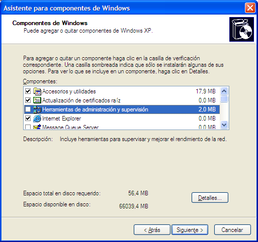
Toggled Selection: The user selects the objects using check-boxes (or toggle buttons). This is the easiest way of discontinuous selection. After the objects have been selected, you can do something with them (delete, process, move, etc.). Selecting a row without ticking the check-box does not select it.
An example of toggled selection can be found in Windows XP in the Add or Remove Windows components dialog. Only the objects that are ticked will be added/removed, not the highlighted row.

Toggled Selection in Windows XP

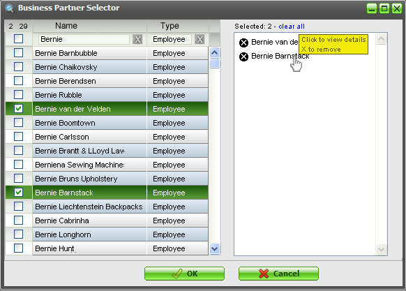
Collected Selection: This concept revolves around placing and accumulating selected objects in a separate bucket. In large lists or lists that span multiple pages, this is an easy way to see which objects already have been selected. We intend to use this for the multiple objects selector that has been discussed earlier.

Multiple Objects Selector concept using Collected Selection

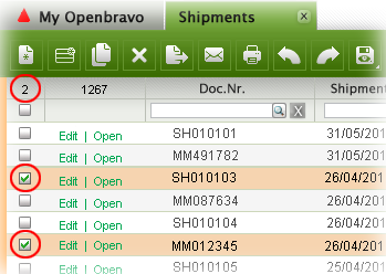
From a usability point of view, this method would also be appropriate in grid selection but less so from a practical (space) point of view. In the 3.0 grids, we will use a snippet of the collected selection method though, by displaying the amount of objects selected in the top left of the grid.

Selection counter

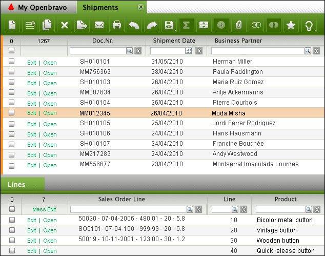
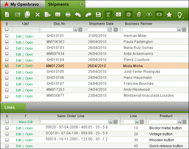
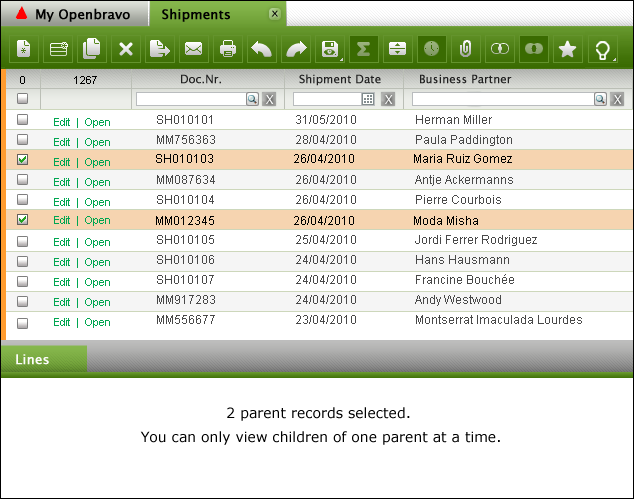
Hybrid Selection: This is a combination of Toggled Selection and Object Selection. This is what we will use for the Openbravo 3.0 grids. In most cases, the user will select one object only, view its children, edit its attributes and apply a process to it. This is object selection. In other cases, the user wants to select multiple objects in a grid via toggled selection. This is where the rows get checked.
Single row selected via Object Selection

Single row selected via Toggled Selection

Multiple rows selected via Toggled Selection

Hybrid Selection recombines the best of three worlds resulting in more efficient document manipulation and lower error rates.

Overview of 3.0 GUI Components

Thursday, September 30, 2010

Release 3.0 of Openbravo will be an exciting release with major improvements in the user experience. A few weeks ago we released 3.0-RC2 that contains only a small part of the total user experience redesign we planned for 3.0-Production (due for Q1 next year).

Over the last year I have shared a lot of material (e.g. scenarios, screenshots, flows, wireframes) with you but - as a community member pointed out recently - some of you might have lost the "bigger picture". So if you want to get an idea of what else is in store, then check out this overview of the 3.0 GUI components

Shipping & Invoicing in 3.0

Thursday, September 2, 2010

The Openbravo flows are coming your way!

In the Enhanced Sales Order project, that we aim to ship in 3.0 Core, it is all about redesigning the existing flows for ordering, invoicing and shipping. In an earlier post I have shared the adventures of Jim, the Computer Seller & Liz, the Order Taker with you and in the meanwhile I have also published scenarios for a sales director (Dan) and a customer carer (Amy). If you haven´t read their adventures and given your feedback yet, then please still do so. You will have to work with it in the end so you better speak up now or forever hold your peace :-)

The latest scenarios look at invoicing and shipping. Using the new 3.0 GUI framework, I have tried to model flows that are as flexible as possible. So you can first take a a sales order and then create an invoice against it, or maybe just for a few lines which means partial invoicing. Or you take a whole lot of orders and generate invoices for all of those at once, perhaps merging invoices for the same customer. Sometimes you want to invoice products, rather than entire sales orders because maybe you were only able to ship one product at a certain point in time. You then would want to create partial invoices for a whole lot of sales orders that contain that specific product. The same goes for shipments. Sometimes you first want to create a shipment document and then pick sales order lines to ship but this could also be done the other way round: first select a sales order (line) and then decide to ship it.

All this is of course dependent on the invoice and delivery terms for the customer. Our current processes and configurations are not always transparent and we need a redesign here as well.

Having said all this, let me ask you for now to look at the Shipping and Invoicing scenarios. There is a lot of complexity once you start looking at all the possible configurations and flows but I want to get the basics right first. Please help me in doing so.

Openbravo ERP 3.0 - Release Candidate 1 is available for download

Friday, July 23, 2010


Release Candidate 1 is our first step towards Openbravo ERP 3.0. It is an early release that is comparable to a pre-alpha release. It gives a sneak peek into what is coming in 3.0 but be aware that this release candidate is largely incomplete. In fact it contains only 39% of the functionality we plan for the 3.0 core delivery.

It sports tabs, quick launch menus, a new application menu and a first stab at the My Openbravo portal page. In addition to the new GUI, we also introduce:

  • A narrowed down scope based on the key flows
  • New standard roles (discuss)
  • Redesigned financial flows, including advanced payables and receivables management (discuss)
View some screenshots, read the release notes, download the virtual appliance, run it in our demo instance online (Openbravo/openbravo) and discuss it all on the early release forum.

Enjoy!