Openbravo's User Experience Lab
GUI design, ERP Usability and Visual Design

Why Hybrid Selection is the right Selection Method for Grids

Monday, November 15, 2010

Openbravo 3.0 release candidate 4 introduces an entire new interaction paradigm for document manipulation. Using a multi-level master-detail page layout it will be possible to view parent and child records, in either grid or form view, simultaneously. Both forms and grids have been redesigned as well and are optimized for the full document life cycle: creating, editing, processing, searching and comparing. One of the most dramatic differences with Openbravo 2.50 is that these tasks now can be done for multiple documents at a time through the multi-tabs GUI, in-grid editing and multiple objects selection in grids. In this article, I´d like to tell you about the different methods for object selection in grids and which method works best for our grids.

Grids consist of rows and columns. Each row represents a record and each column represents an attribute of that record. A single select in a grid is simply done by clicking on a row. The row will be selected and the screen will update all related information (e.g. children) to the selection. It is common to highlight the row to give the user a visual cue of what is selected. Multiple, discontinuous rows can be selected using a CTRL- (Windows) or CMD- (Mac) click combination. Multiple, continuous rows can be selected using a SHIFT-click combination. A combination of the above is possible using these key-click combinations but this is not recommendable as it is very easy to lose the selected set by clicking or pressing wrongly by mistake. This is especially the case when the selected set is out of sight because of vertical scrolling.

This is where the use of check-boxes comes in handy. Traditionally the preferred choice for multiple selection, they became "out of fashion" in the last decade in favor of other multiple selection methods. Now they´re back and we want to use them in a way that combines different selection methods:

Object Selection: The simplest method of direct selection: The user selects one object and manipulates it directly. For example, you select a folder (icon) and drag it into the trash bin on your desktop. This was quite a revolution in 1984 when Apple introduced their first graphical user interface. Command line interfaces (the standard at that time) used an indirect way of manipulation where you first had to define the action and then point to the object, e.g. deltree c:\myfolder.

Object Selection in early Mac OS

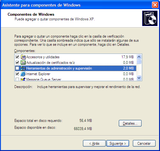
Toggled Selection: The user selects the objects using check-boxes (or toggle buttons). This is the easiest way of discontinuous selection. After the objects have been selected, you can do something with them (delete, process, move, etc.). Selecting a row without ticking the check-box does not select it.
An example of toggled selection can be found in Windows XP in the Add or Remove Windows components dialog. Only the objects that are ticked will be added/removed, not the highlighted row.

Toggled Selection in Windows XP
Collected Selection: This concept revolves around placing and accumulating selected objects in a separate bucket. In large lists or lists that span multiple pages, this is an easy way to see which objects already have been selected. We intend to use this for the multiple objects selector that has been discussed earlier.

Multiple Objects Selector concept using Collected Selection
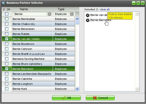
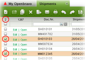
From a usability point of view, this method would also be appropriate in grid selection but less so from a practical (space) point of view. In the 3.0 grids, we will use a snippet of the collected selection method though, by displaying the amount of objects selected in the top left of the grid.

Selection counter
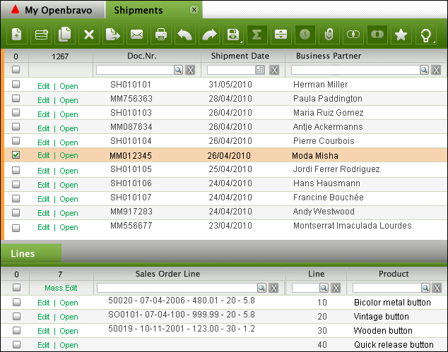
Hybrid Selection: This is a combination of Toggled Selection and Object Selection. This is what we will use for the Openbravo 3.0 grids. In most cases, the user will select one object only, view its children, edit its attributes and apply a process to it. This is object selection. In other cases, the user wants to select multiple objects in a grid via toggled selection. This is where the rows get checked.
Single row selected via Object Selection
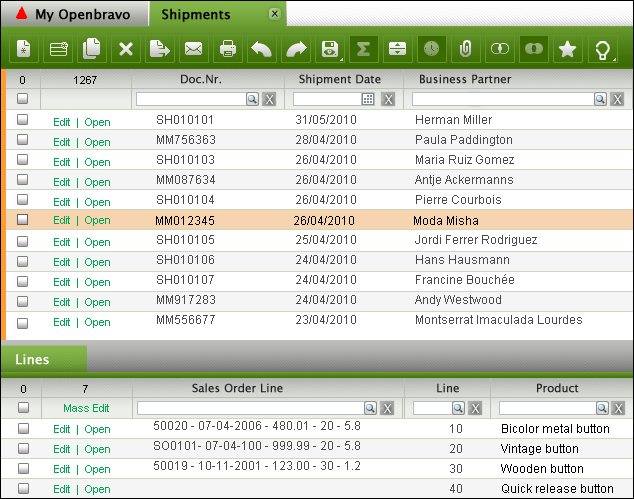
Single row selected via Toggled Selection
Multiple rows selected via Toggled Selection
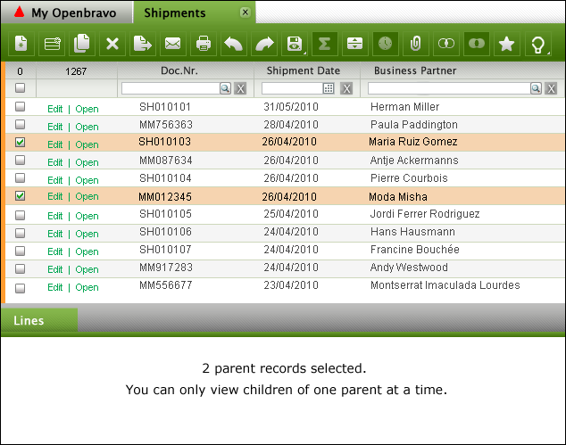
Hybrid Selection recombines the best of three worlds resulting in more efficient document manipulation and lower error rates.

UX Storytellers: My Story about Wet Cats and Openbravo

Saturday, November 6, 2010

A while ago I was invited to write a story related to the User Experience domain in order to publish it in a book together with stories of other user experience professionals from around the world. Although I am still alive :-) I felt flattered to write my "mémoirs" and grabbed the opportunity to share what I have learned in my career. The book ‘UX Storytellers - Connecting the Dots’ is now ready.

My story starts with wet cats and ends with reflections on the challenges and rewards of designing the user experience for ERP software at Openbravo.

The hard copy will ship in January. For now, there is a free PDF download

‘The Wet Cat’ can be found on page 542 (Scribd) or page 571 (PDF)

Business Software is Boring

Wednesday, October 20, 2010

Last night I attended the Barcelona Design Week event. The first night kicked off with a round table discussion about design management and speakers of sexy companies such as Google, Vodafone and Lékéu shared their opinions on the importance of design for their companies.

The fourth speaker was Prashanth Padmanabhan, product manager for human capital management software at SAP. He was the last to present himself and started with an apology that his products weren´t as exciting as those of the other speakers . He went as far as saying that the software that SAP produces is so boring that actually you want to minimize the time interacting with the software!

This made me smile because I can relate to this. In general most business applications are not much fun to use. Is this because business applications are per definition boring as they are used to execute work? I don´t buy this. For the work I´m doing, I use Adobe Photoshop a lot and I truly enjoy it. A pilot probably enjoys flying a plane and I cannot imagine cooks that do not like their knives and pots.

So what makes most business software so tedious to use that it can cause mental weariness? Here are a number of factors that come into mind when you think of "boring":

  • Impersonal: the software does not seem to care about you and does not want to adapt to you
  • Arrogant: the system treats you as if it´s your fault when things go wrong
  • Technology driven, not human: yes, the software runs on an application server, pulls records from a database using SQL and is written in Java but guess what, I do not care!
  • Fear of failure: the application does not give me confidence. I´m afraid of doing the wrong thing, losing data or looking like a fool to my colleagues
  • Does not speak the user´s language: why do I have to talk the system´s language? Who´s in charge here? Hal? Hal?
  • Hard to learn: unless my boss lets me do a one week course, it will be very hard to get to know the system
  • Gives information you don´t need: reminds me of the Windows XP message: "You have unused icons on your desktop"
  • Does not answer your questions: I´m sure the answer sits somewhere in the system, I just don´t know how to get it out
  • Inefficient: do I really have to do all this to complete my task?
  • Visually not pleasing: only moms like to look at ugly babies
At Openbravo we realized this a while ago and since then we have been working hard to improve the user experience and with our upcoming 3.0 release our users can enjoy a whole bunch of usability enhancements that will make working with our software much easier and perhaps even enjoyable.

Later I had a chat with Prashanth about his remark and he explained that SAP is also aware of this and that they are going to invest heavily in the end-user´s experience, rather than designing for decision makers who buy the software.

This is all good news. If we, as software designers, point and keep our focus on the end users, everybody will benefit. Our users will enjoy their work more, they will be more productive and will have more time left for creative and interesting tasks. The companies that employ them will see less employee turnover, more happy faces, less sick days, more employee-led innovation and will become more profitable at the end of the day.

Overview of 3.0 GUI Components

Thursday, September 30, 2010

Release 3.0 of Openbravo will be an exciting release with major improvements in the user experience. A few weeks ago we released 3.0-RC2 that contains only a small part of the total user experience redesign we planned for 3.0-Production (due for Q1 next year).

Over the last year I have shared a lot of material (e.g. scenarios, screenshots, flows, wireframes) with you but - as a community member pointed out recently - some of you might have lost the "bigger picture". So if you want to get an idea of what else is in store, then check out this overview of the 3.0 GUI components

Shipping & Invoicing in 3.0

Thursday, September 2, 2010

The Openbravo flows are coming your way!

In the Enhanced Sales Order project, that we aim to ship in 3.0 Core, it is all about redesigning the existing flows for ordering, invoicing and shipping. In an earlier post I have shared the adventures of Jim, the Computer Seller & Liz, the Order Taker with you and in the meanwhile I have also published scenarios for a sales director (Dan) and a customer carer (Amy). If you haven´t read their adventures and given your feedback yet, then please still do so. You will have to work with it in the end so you better speak up now or forever hold your peace :-)

The latest scenarios look at invoicing and shipping. Using the new 3.0 GUI framework, I have tried to model flows that are as flexible as possible. So you can first take a a sales order and then create an invoice against it, or maybe just for a few lines which means partial invoicing. Or you take a whole lot of orders and generate invoices for all of those at once, perhaps merging invoices for the same customer. Sometimes you want to invoice products, rather than entire sales orders because maybe you were only able to ship one product at a certain point in time. You then would want to create partial invoices for a whole lot of sales orders that contain that specific product. The same goes for shipments. Sometimes you first want to create a shipment document and then pick sales order lines to ship but this could also be done the other way round: first select a sales order (line) and then decide to ship it.

All this is of course dependent on the invoice and delivery terms for the customer. Our current processes and configurations are not always transparent and we need a redesign here as well.

Having said all this, let me ask you for now to look at the Shipping and Invoicing scenarios. There is a lot of complexity once you start looking at all the possible configurations and flows but I want to get the basics right first. Please help me in doing so.

Quick Line Picking & Price Lists

Tuesday, August 10, 2010

As part of the 3.0 release which includes a redesigned Sales Order Flow, we are looking at the Copy Lines and Copy From Order functionality. From now on the two together will be called Quick Line Picking. During brainstorms the following ideas/issues surfaced:

  • Price list must be added as a filter as sometimes you want to pick products that never have been ordered before
  • Consumption days concept does not make much sense and is tucked away too deeply. Extend date range filter to more human ranges such as “last week” or “last quarter”
  • Most frequently ordered makes sense as it is likely that popular orders will be repeated
  • Most recently ordered makes sense as it is likely that recent orders will be repeated
  • Product category makes sense as a filter ("I only want to order hardware")
  • Show for each product the sales/purchase order they belong to. Clicking the order will open it on a new tab so you can peek into it and see the rest of the order
  • Use extra dedicated filters for the most important attributes. Use column filters for the less relevant filters
  • Set default filters to avoid massive volumes
  • Save filter settings for reuse per window type and user
We also thought of combining orders and lines in one grid, perhaps grouping them in expandable sections (Family Grid style) but the drawback is that the amount of rows in an expanded state can become excessive as it is a Cartesian product where every product is shown multiple times, as it belongs to multiple sales orders. In this stage I am not convinced about the real advantage of doing so, as selecting an entire order and then removing one or two products in the sales order lines grid afterwards is hardly an effort. However, a simplified version that used a column Last Order Used (page 18 in the PDF in the Forge link below) helps the user grouping products that belong to the last order.

I plan to keep Copy Lines and Copy From Order in separate windows (in fact, they are layers in 3.0 style) but the user can easily switch between them. I believe that a user either wants to select products from price lists or recent orders OR wants to reuse and merge all order lines from entire orders OR wants to duplicate a past order, including all its header and lines data. This last option can also be done in a grid by duplicating the row. So we´ll have three flavors to reuse order lines. The proposed solution tries to satisfy all three methods.

The Price List is the most important attribute in order line picking. The Price List is now set in the header. The lines to pick should have it as a default filter, although it should also still be possible to choose products from other price lists. The Price List Version is currently not used in the header. The new proposal does have it in the header although I am not certain if this is a good idea or not, so help me out here.

Then there is a whole set of business logic we need to rethink when adding products from a non-default price list or even more than one, which can get quite complicated when products exist in more than one price list.

I have attempted to model all of the above thoughts in an extended sales order scenario, see the first PDF document via the link below. The second PDF shows some background on Price Lists. I also noticed that the price list setup is very tedious. We must tackle this as well at some point but let´s first focus on the sales order flow.

Please have a good look and let us know if this all makes sense to you. Find the proposed solution and the discussion thread on this Forge forum.

Openbravo ERP 3.0 - Release Candidate 1 is available for download

Friday, July 23, 2010


Release Candidate 1 is our first step towards Openbravo ERP 3.0. It is an early release that is comparable to a pre-alpha release. It gives a sneak peek into what is coming in 3.0 but be aware that this release candidate is largely incomplete. In fact it contains only 39% of the functionality we plan for the 3.0 core delivery.

It sports tabs, quick launch menus, a new application menu and a first stab at the My Openbravo portal page. In addition to the new GUI, we also introduce:

  • A narrowed down scope based on the key flows
  • New standard roles (discuss)
  • Redesigned financial flows, including advanced payables and receivables management (discuss)
View some screenshots, read the release notes, download the virtual appliance, run it in our demo instance online (Openbravo/openbravo) and discuss it all on the early release forum.

Enjoy!