In my last blog post, I presented you with 24 ideas for Openbravo Workspace Widgets but I have to admit that these images were a bit of a tease, using smoke & mirrors in Photoshop. So now let´s put the money where our mouth is and build them for real with the step-by-step guide below that shows you how to create a simple widget for the Openbravo Workspace.
Before you start, make sure you are running Openbravo 3.0 - RC3 (release notes here) in Firefox and that your are logged in as a System Administrator.
You will be able to build your own widget in less than 5 minutes and share them with your team. If you also want to register and publish your widgets as a module, see Appendix II in the guide.
Share your experiences on the UX Labs forum. Here you will also find some source URLs for a number of widgets: Calendar, Motion Chart, Google Insights & Google Docs. Just copy & paste this in your widget definition. Add yours if you find some nice ones.
How to create an Openbravo Workspace Widget
Thursday, December 2, 2010
24 Ideas for Openbravo Workspace Widgets
Wednesday, December 1, 2010
With Release Candidate 3 (RC3) we are one step closer to delivering the promise of Openbravo 3.0. In this blog post I want to focus on the most important change in RC3: Fully functional Workspace Widgets. I will give you 24 examples of all the cool things you can do with them.

In RC1 and RC2 the MyOpenbravo tab (from now on called: Workspace) already featured a set of static "fake" widgets that served as a preview of the real thing. In RC3, we have rebuilt them as components that are defined in the Application Dictionary and can be packaged as modules. This means that from now on you can start designing, developing and deploying widgets and share them with your team, company or the world. We will get you started with a set of out-of-the-box widgets but the real interesting ones will be developed by our community. Although our audience is different and smaller in volume than that for the iPhone or Android App Stores, I can´t help believing in a similar burst of creativity for our Openbravo Workspace Widgets. Everybody to whom I explained the concept of Workspace Widgets in the last months, instantly came up with amazing ideas, whether they be productivity enhancing, insight providing, process streamlining or just fun.
Through this blog post I want to get the creative juices flowing so here´s a bunch of raw ideas for Openbravo Workspace Widgets. Leave your comments below the images.
I am very excited to learn what you will come up with. Start building widgets now or first share your ideas here.
In a few days I will explain how to create a simple widget. [ update: here it is ]
Why Hybrid Selection is the right Selection Method for Grids
Monday, November 15, 2010
Openbravo 3.0 release candidate 4 introduces an entire new interaction paradigm for document manipulation. Using a multi-level master-detail page layout it will be possible to view parent and child records, in either grid or form view, simultaneously. Both forms and grids have been redesigned as well and are optimized for the full document life cycle: creating, editing, processing, searching and comparing. One of the most dramatic differences with Openbravo 2.50 is that these tasks now can be done for multiple documents at a time through the multi-tabs GUI, in-grid editing and multiple objects selection in grids. In this article, I´d like to tell you about the different methods for object selection in grids and which method works best for our grids.
Grids consist of rows and columns. Each row represents a record and each column represents an attribute of that record. A single select in a grid is simply done by clicking on a row. The row will be selected and the screen will update all related information (e.g. children) to the selection. It is common to highlight the row to give the user a visual cue of what is selected. Multiple, discontinuous rows can be selected using a CTRL- (Windows) or CMD- (Mac) click combination. Multiple, continuous rows can be selected using a SHIFT-click combination. A combination of the above is possible using these key-click combinations but this is not recommendable as it is very easy to lose the selected set by clicking or pressing wrongly by mistake. This is especially the case when the selected set is out of sight because of vertical scrolling.
This is where the use of check-boxes comes in handy. Traditionally the preferred choice for multiple selection, they became "out of fashion" in the last decade in favor of other multiple selection methods. Now they´re back and we want to use them in a way that combines different selection methods:
Object Selection: The simplest method of direct selection: The user selects one object and manipulates it directly. For example, you select a folder (icon) and drag it into the trash bin on your desktop. This was quite a revolution in 1984 when Apple introduced their first graphical user interface. Command line interfaces (the standard at that time) used an indirect way of manipulation where you first had to define the action and then point to the object, e.g. deltree c:\myfolder.
Object Selection in early Mac OS

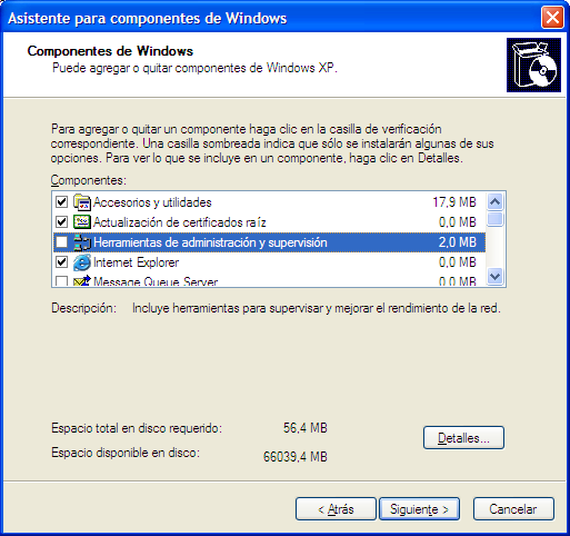
An example of toggled selection can be found in Windows XP in the Add or Remove Windows components dialog. Only the objects that are ticked will be added/removed, not the highlighted row.
Toggled Selection in Windows XP
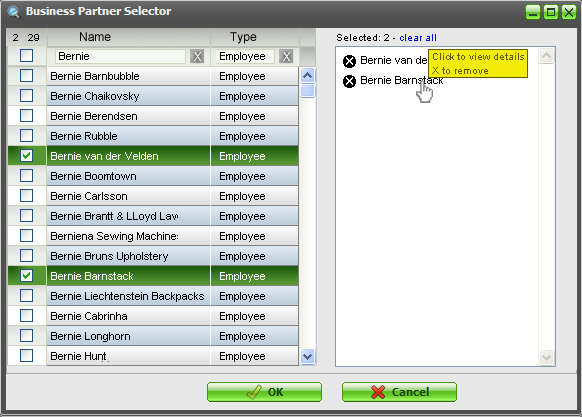
Collected Selection: This concept revolves around placing and accumulating selected objects in a separate bucket. In large lists or lists that span multiple pages, this is an easy way to see which objects already have been selected. We intend to use this for the multiple objects selector that has been discussed earlier.
Multiple Objects Selector concept using Collected Selection
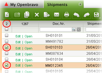
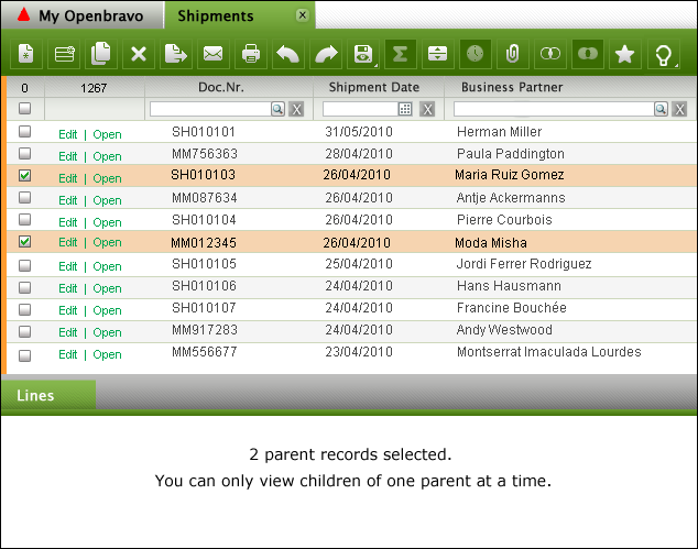
From a usability point of view, this method would also be appropriate in grid selection but less so from a practical (space) point of view. In the 3.0 grids, we will use a snippet of the collected selection method though, by displaying the amount of objects selected in the top left of the grid.
Selection counter
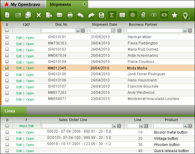
Hybrid Selection: This is a combination of Toggled Selection and Object Selection. This is what we will use for the Openbravo 3.0 grids. In most cases, the user will select one object only, view its children, edit its attributes and apply a process to it. This is object selection. In other cases, the user wants to select multiple objects in a grid via toggled selection. This is where the rows get checked.
Single row selected via Object Selection

Single row selected via Toggled Selection
Multiple rows selected via Toggled Selection
Hybrid Selection recombines the best of three worlds resulting in more efficient document manipulation and lower error rates.
UX Storytellers: My Story about Wet Cats and Openbravo
Saturday, November 6, 2010
A while ago I was invited to write a story related to the User Experience domain in order to publish it in a book together with stories of other user experience professionals from around the world. Although I am still alive :-) I felt flattered to write my "mémoirs" and grabbed the opportunity to share what I have learned in my career. The book ‘UX Storytellers - Connecting the Dots’ is now ready.

The hard copy will ship in January. For now, there is a free PDF download
‘The Wet Cat’ can be found on page 542 (Scribd) or page 571 (PDF)
Business Software is Boring
Wednesday, October 20, 2010
- Impersonal: the software does not seem to care about you and does not want to adapt to you
- Arrogant: the system treats you as if it´s your fault when things go wrong
- Technology driven, not human: yes, the software runs on an application server, pulls records from a database using SQL and is written in Java but guess what, I do not care!
- Fear of failure: the application does not give me confidence. I´m afraid of doing the wrong thing, losing data or looking like a fool to my colleagues
- Does not speak the user´s language: why do I have to talk the system´s language? Who´s in charge here? Hal? Hal?
- Hard to learn: unless my boss lets me do a one week course, it will be very hard to get to know the system
- Gives information you don´t need: reminds me of the Windows XP message: "You have unused icons on your desktop"
- Does not answer your questions: I´m sure the answer sits somewhere in the system, I just don´t know how to get it out
- Inefficient: do I really have to do all this to complete my task?
- Visually not pleasing: only moms like to look at ugly babies
Overview of 3.0 GUI Components
Thursday, September 30, 2010
Release 3.0 of Openbravo will be an exciting release with major improvements in the user experience. A few weeks ago we released 3.0-RC2 that contains only a small part of the total user experience redesign we planned for 3.0-Production (due for Q1 next year).

Shipping & Invoicing in 3.0
Thursday, September 2, 2010
 |
| The Openbravo flows are coming your way! |
In the Enhanced Sales Order project, that we aim to ship in 3.0 Core, it is all about redesigning the existing flows for ordering, invoicing and shipping. In an earlier post I have shared the adventures of Jim, the Computer Seller & Liz, the Order Taker with you and in the meanwhile I have also published scenarios for a sales director (Dan) and a customer carer (Amy). If you haven´t read their adventures and given your feedback yet, then please still do so. You will have to work with it in the end so you better speak up now or forever hold your peace :-)
The latest scenarios look at invoicing and shipping. Using the new 3.0 GUI framework, I have tried to model flows that are as flexible as possible. So you can first take a a sales order and then create an invoice against it, or maybe just for a few lines which means partial invoicing. Or you take a whole lot of orders and generate invoices for all of those at once, perhaps merging invoices for the same customer. Sometimes you want to invoice products, rather than entire sales orders because maybe you were only able to ship one product at a certain point in time. You then would want to create partial invoices for a whole lot of sales orders that contain that specific product. The same goes for shipments. Sometimes you first want to create a shipment document and then pick sales order lines to ship but this could also be done the other way round: first select a sales order (line) and then decide to ship it.
All this is of course dependent on the invoice and delivery terms for the customer. Our current processes and configurations are not always transparent and we need a redesign here as well.
Having said all this, let me ask you for now to look at the Shipping and Invoicing scenarios. There is a lot of complexity once you start looking at all the possible configurations and flows but I want to get the basics right first. Please help me in doing so.
Quick Line Picking & Price Lists
Tuesday, August 10, 2010

- Price list must be added as a filter as sometimes you want to pick products that never have been ordered before
- Consumption days concept does not make much sense and is tucked away too deeply. Extend date range filter to more human ranges such as “last week” or “last quarter”
- Most frequently ordered makes sense as it is likely that popular orders will be repeated
- Most recently ordered makes sense as it is likely that recent orders will be repeated
- Product category makes sense as a filter ("I only want to order hardware")
- Show for each product the sales/purchase order they belong to. Clicking the order will open it on a new tab so you can peek into it and see the rest of the order
- Use extra dedicated filters for the most important attributes. Use column filters for the less relevant filters
- Set default filters to avoid massive volumes
- Save filter settings for reuse per window type and user
I plan to keep Copy Lines and Copy From Order in separate windows (in fact, they are layers in 3.0 style) but the user can easily switch between them. I believe that a user either wants to select products from price lists or recent orders OR wants to reuse and merge all order lines from entire orders OR wants to duplicate a past order, including all its header and lines data. This last option can also be done in a grid by duplicating the row. So we´ll have three flavors to reuse order lines. The proposed solution tries to satisfy all three methods.
The Price List is the most important attribute in order line picking. The Price List is now set in the header. The lines to pick should have it as a default filter, although it should also still be possible to choose products from other price lists. The Price List Version is currently not used in the header. The new proposal does have it in the header although I am not certain if this is a good idea or not, so help me out here.
Then there is a whole set of business logic we need to rethink when adding products from a non-default price list or even more than one, which can get quite complicated when products exist in more than one price list.
I have attempted to model all of the above thoughts in an extended sales order scenario, see the first PDF document via the link below. The second PDF shows some background on Price Lists. I also noticed that the price list setup is very tedious. We must tackle this as well at some point but let´s first focus on the sales order flow.
Please have a good look and let us know if this all makes sense to you. Find the proposed solution and the discussion thread on this Forge forum.
Openbravo ERP 3.0 - Release Candidate 1 is available for download
Friday, July 23, 2010

Release Candidate 1 is our first step towards Openbravo ERP 3.0. It is an early release that is comparable to a pre-alpha release. It gives a sneak peek into what is coming in 3.0 but be aware that this release candidate is largely incomplete. In fact it contains only 39% of the functionality we plan for the 3.0 core delivery.
It sports tabs, quick launch menus, a new application menu and a first stab at the My Openbravo portal page. In addition to the new GUI, we also introduce:
- A narrowed down scope based on the key flows
- New standard roles (discuss)
- Redesigned financial flows, including advanced payables and receivables management (discuss)
Enjoy!
The Family Grid - part II
Monday, July 12, 2010

Simple, real-time business intelligence by manipulating grids
Reporting is an essential part of everyday business and therefore an essential part of an ERP. Today´s businesses need relevant, up-to-date, accurate and consumable metrics that help them make the right decisions. Traditionally, reports are generated once in a while (month, quarter) and are exported to PDF for printing & annotating or Excel for further manipulation. Reports are used in presentations and meetings to look at past performance, understand the status quo and project future performance. The danger lies in the choice of dimensions and the interpretation of the data. Reports are static and generated as a one-off document with a set of dimensions, normally defined by a ready-made SQL query or via a visual query builder. Openbravo´s Sales Dimensional Reports allow the user to choose a number of filters and dimensions and even the sorting order can be set. This works well if the user knows in advance what metrics she is looking for and what data set she wants to look at. The drawback is that it does not allow analyzing the data in realtime by changing the filters and dimensions and looking at the impact on the results while doing so.
A while ago, in the Family Grid, I have presented a fairly abstract idea for basic business intelligence functionality by combining parent and child data in one grid, joining grids and filtering and aggregating columns. Now, I´d like to show you a more simplified version of this idea.
The Family Grid II scenario (download it here) lets the user view sales orders in one grid and a set of order lines for all of these in the other. Both the sales order grid and the order lines grid can be filtered on any attribute using column filters. Columns containing numerical values can be aggregated (sum, count, average, median). The grids can be joined (inner or outer join) with the click of a button which, for example, lets the user find all sales order that contain a certain product (or all sales that do not contain that certain product). Final result sets can be exported to Excel or PDF and the view (which is in fact a query rather than a report) can be saved for reuse.
It should be noted that this approach does not intend to replace traditional reporting because many SQL queries just cannot be build using the Family Grid. However, I believe that this way of manipulating grids is very powerful and can lead to insights that can be hard to discover using traditional one-way reporting. Playing with a data set in real time using parent and child grids, filters, aggregations and joins with an easy-to-use GUI lets non-expert users unlock the power of data in an ERP without having to invest in hi-end business intelligent software.
Are you as convinced as I am about the business value of this feature? Discuss it here.
By the way, we´re not happy with the name of this functionality. Family Grid does not cover it really. What about RapidGrid, GridSift, PowerGrid, Data Distiller, Metrix, EasyAnswer, RapidAnswer, IntelliGrid, "Openbravo RapidEdge Edition – the fastest way to start a competitive edge", "PerfectGrid - the fast & simple way to your information"?
New Multiple Selection Widget Proposal
Thursday, July 8, 2010
Check out this concept for a selector that allows for multiple object selection. It´s a hybrid between toggled selection (using checkboxes to select multiple and discontinuous objects) and collected selection. See how it works.
To Stretch or Not to Stretch

In this stage we´re almost done with the HTML for the forms and grids for the 3.0 GUI. We´ve built two versions for the forms:
1. Fixed width fields. Example here
2. Relative width fields: depending on screen resolution, the fields will be stretched. Example here
Both have pros and cons. Fixed width fields are easier to scan (especially on wide screen monitors) and I suspect them to be faster in use (although the difference may be insignificant). Relative width fields allow for long value input, without the value (string of characters) being cut off. Nothing more annoying than not being able to distinguish a value because the most distinguishing characters are at the end, just outside the field.
There is even a third option: variable length input fields are pretty cool as well but I´m afraid of a creating messy forms when fields stretch individually so in case you wanted to suggest this: Don´t :-)
Also, the tab order in these demo sites follow the html by default, which is up to down. The current OB form tab order goes from the left to the right. What works best for you?
I would like to hear you opinion & experiences on both topics. Drop you reactions here.
Openbravo San Fermin: Let the Bull run through your Company
Monday, July 5, 2010

Pamplona is the birthplace of our flagship product Openbravo ERP but it is probably better known for its yearly San Fermin festival where millions of people gather to watch the famous encierro, the running of the bulls. This year we wanted to share a bit of local pride with you by letting the bull run through your company as well. We´ve created a San Fermin skin that can be downloaded as a module and applied to your instance. Find the instructions here.
We´ve also painted our demo site red (http://demo.openbravo.com) , go have a look!
A special thanks to Miguel Rodriguez Font who created the bull logo, beautifully crafted using graphic characters only.
Attend a UFO on ESO
Monday, June 14, 2010

In plain English this means: Hereby I invite you to participate in a series of User Feedback Opportunities (UFOs) on the Enhanced Sales Order Flow redesign project (ESO) we have started recently.
The objective of these sessions is to gather feedback on our design work. Using the input given, we can then modify, improve and tweak iteratively, leading eventually to a high quality, tested and low-risk design that will be used in Openbravo ERP 3.0.
The dates are as follows:
--------------------------------------------
Wednesday June 16th, 11.30-12.30h
(replacing Product Development meeting)
Jim, The Computer Seller
Download Scenario here
--------------------------------------------
Friday June 18nd, 11.30-12.30h
Liz, The Order Taker
Download Scenario here
--------------------------------------------
Wednesday June 23th, 11.30-12.30h
Dan, The Sales Director
Download Scenario here
--------------------------------------------
Friday June 25th, 11.30-12.30h
Amy, The Customer Carer
Download Scenario here
--------------------------------------------
It is necessary to download and review the materials prior to the sessions. For every session we will use one scenario (images + story) in a PDF document. Having this document open or printed is recommended to make it easier to refer to the images.
The sessions will be held through IRC** on irc://freenode/openbravo and the sessions will be open to all. Feel free to invite business partners, colleagues or end users with an interest in sales orders.
Hopefully I will "see" you online on one (or all!) of these dates!
Rob Goris, User Experience Architect - Openbravo
**For those of you who are not familiar with IRC chatting:
The easiest way is to use the webchat from irc.freenode.net, and you don't need to install anything.
* Go to: http://webchat.freenode.net/
* Pick a Nickname
* Channels: #openbravo
You can also install Chatzilla as an extension for Firefox:
You can install Chatzilla via:
* Tools - Add-ons - Tab Get Add-ons - Enter Chatzilla in search box
* Once installed: Tools - Chatzilla
* In Chatzilla, enter:
/attach irc.freenode.net
/join #openbravo
Sales Orders with Jim & Liz
Thursday, June 10, 2010

We are going to follow two of our protagonistas in real life sales order scenarios.
Jim works in a large electronics store and is selling a BigBook Pro computer to an initially unknown customer. The quote and sales order is created. The stock is checked, the delivery address is entered. The order and invoice are paid on the spot in cash.
Liz works in the financial department as an administrative assistant. She receives an email from her colleague, a sales person with a sales order attached. Liz is now going to enter this sales order in Openbravo ERP.
Both Jim and Liz spend a lot of time doing this type of activities. For them it is crucial to have an ERP that lets them create sales orders the easy, fast and smart way.
Check out the scenarios and let us know whether you think we are doing the right thing for our imaginary friends.
New Sales Order Flow
Thursday, May 27, 2010

We are redesigning the Sales Order flow. This will be done from scratch, starting with customer stories, user research and process modeling. Then we´ll produce mockups that will be shared with you for feedback. The redesign will use 3.0 GUI design patterns and technology.
I´d like to ask you to share ideas, requirements, suggestions and pains here.
My Openbravo: The First Version
Thursday, May 6, 2010
 We are now looking at the first tab in the Openbravo ERP 3.0 GUI. It will contain a My Openbravo workspace. This should contain a set of portlets/widgets displaying metrics, links, applications or charts. Think of a portal similar to iGoogle, NetVibes and My Yahoo! where the user can decide what to show.
Have a look at the My Openbravo page and a version that shows how to edit.
It should work roughly as follows:
- Left column is filled with links to recent documents and views. Clicking them opens a new tab and takes the user there. Recent views also have Create New links.
- Below that we see two links that let you add widgets. The link Add Library Widget most likely opens a listbox with the available widgets. The link Add Feed Widget opens a dialog where the user enters a URL pointing at an RSS feed.
- What´s in the widget is not really the important point now, but I have created some examples that you can find in the presentation mentioned below.
- In the widget header there are two buttons: maximize and edit. Edit will pop out a little green menu that shows a number of options to move, edit and delete the widget. The first menu option Edit this widget will invoke the bigger green panel (as shown in the Invoiced widget) where attributes can be modified. In this case the user can set the time range.
- Consultants should be able to create (or modify) widgets where grids are shown with a number of columns/attributes, possibly cheered up by a graph. The consultant then also determines which attributes can be set (when the user clicks edit).
As a first set, I would propose to produce at least one grid-chart widget, an RSS feed widget, alerts and saved searches.
Find a more elaborate PDF presentation and leave your feedback here.
Bed Time for the Click and Scroll Myths
Friday, April 30, 2010
 In site or application design, it is recommended to use best practices, rules-of-thumb and proven principles. User experience specialists validate most of their ideas and designs using those. In case they can't find any, they mostly resort to usability testing, trying to prove that something works or not.
Over the years, some of the rules-of-thumb have seeped through to the broader audience and are now widely used and abused. Some classic examples are: "Flash is Bad", "Frames Suck", "People don’t scroll!” and the most obstinate of them all must be "I should be able to find everything on a site in just three-clicks!".
The first two claims at least can be defended with reasoning and by the simple fact that Jakob Nielsen´s words are not to be disputed. The claims that user don´t scroll and that every page must be reached within three clicks are myths. There is no scientific proof or sound reasoning behind them.
In the case of scrolling, some 15 years ago many first time web users had to get used to content being spread out over a larger vertical area that needed scrolling to be viewed. Now, in 2010, it is not hard to assume that people learned how to use a mouse. Obviously, for advertising, being above the fold makes sense as more people will see your ad when landing on the page (where else are they going to look?). In the context of user tasks, users are willing to scroll, although they say they don't. Even Jakob Nielsen succumbed in 1997 and wrote that scrolling is now allowed.
My favorite myth is the Three-Click-Rule. In countless discussions with clients, management and developers I have heard this "argument" being used. I confess that I even shamelessly used it against others when it served me well. I have always kept my mouth shut when The Myth was used against me when designing e-commerce sites because it always made sort of sense to me to get that 12-piece knife set in gift wrapping as soon as possible in the basket and checked out before the customer changes her mind. And even in this case research has shown that The Myth does not hold true. User Interface Engineering (UIE) conducted an analysis showing that there wasn't any more likelihood of a user quitting their purchase process after three clicks than after 12 clicks. In the same analysis we can find that user satisfaction does not suffer with more clicks either: Fewer clicks do not make more satisfied users.
So, user frustration and success rates in task completion do not depend on the number of clicks. Nor do they rely on not having to scroll. What really matters is that users can find what they are looking for, which depends on many factors such as flow, layout, interaction and visual design. If users find what they are looking for in a logical (and therefore effortlessly reproducible & memorizable) manner, both success rates in task-completion and user satisfaction will be higher.
Most - if not all - of the research on these topics was conducted on web sites rather than applications but I suspect little difference in its applicability. In the case of business applications, such as ERP software, we need to be a little bit more careful because of the factor productivity. Productivity is output per unit which in most cases can be captured as work per time unit. This is where speed comes in. In our case, the speed of operation of the user is very important. It depends on the response time of the system and the user interface. The first is a purely technical matter; the second depends on the GUI design. I believe that the number of clicks and the amount of scrolling has little impact on the user productivity as long as the user has easy access to all information that is needed for the task at hand and all steps in the task flow are logical, predictable and reversible. Also: providing defaults, offering validation, saving preferences and supporting different modes of seeking information boosts user´s productivity.
If we look at an example of creating a sales order: Most of the time spent executing this task is spent on finding documents and entering and validating field values, either for headers or lines and in grids or forms. The time spent on clicking and scrolling is negligible compared to that. Making sure the user finds the right documents, processes, forms and fields and making sure that she performs the process steps in the right order without making mistakes is much more important.
Another great productivity enhancer is using keyboard shortcuts. Here the same applies: the amount of key presses is not very important, the underlying logic is.
There is nothing negative to be said against trying to minimize the amount of mouse clicking or scrolling, it even helps designers rethink their solutions and simplify process steps. They just should not be used as a rule or best practice. Let´s put these click and scroll myths to bed and start focusing on good design.
Photo courtesy of Thad Zajdowicz
Test Drive the new Selector
Monday, February 15, 2010
Selecting an object such as a business partner or a product "on the fly" while editing a form is a frequent task. In the current ERP we support this by providing a UI Selector that lets you choose the object using filters in a popup. The solution we have used so far is very powerful but not very usable. Clearing filters is awkward and it does not support suggestions or any other assistance in speeding up the filtering process. With the new UI Selector we believe these problems will be past tense. Using SmartClient technology we have built a UI Selector that makes use of suggestions (using live filtering) and applies column filtering in the grid.
We have created a test instance where you can play with the new selector.
Go to http://79.125.36.179/openbravo/security/Menu.html
Log in with selector/test
Navigate to Sales Management > Transactions > Sales Order. The business partner and product selector have been enabled for the sales order header and line.
You can use the following keyboard shortcuts:
Ctrl-enter opens the popup /layer
Alt-arrow-down opens the suggestion dropdown The new selector can be defined without programming. The definition is done in the application dictionary similar to windows and tabs. Selectors can be changed at runtime by a consultant without re-starting the system or re-compiling.
We intend to initially publish this as a commercial module and later open it up to the whole community as part of Openbravo ERP 3.0.
Let us know your findings on the UX Lab.