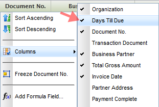
They were introduced in maintenance pack 4 last month but have not been given the attention they deserve: Filter Expressions. These are handy clauses that can be applied to grids. Examples are "greater than" (>), "between" (...) or even the more uncommon ones such as "does not end with" (!@) and many more. A boolean "or" can also be used to combine expressions, such as 0...100 or >200, which is "between 0 and 100 or greater than 200".

Once you have created a complex set of filter expressions for your grid, such as "All unpaid invoices in USD with a value higher than $1000 and more than 21 days overdue for customers with names starting with A to G", you may want to use Saving Views to avoid rework next time you want to apply the same filter set.
Here´s the complete list of filter expressions.
Filter Expressions
Tuesday, November 29, 2011
Openbravo Mobile - Idea Phase
Tuesday, November 15, 2011
After the first month working on Openbravo Mobile, here´s a little update in pictures on the progress. At the bottom you will find links to a clickable mockup you can play with. Enjoy and let us know what you think.
First, we had to change our mindset from PC to mobile. My first thought was: "How is Openbravo 3 ever going to fit on a mobile device without losing the great user experience?"

Then we dedicated some weeks to analysis, sketching and playing with phones, pads and every device we could lay our hands on:

It became clear that we had to reduce the PC GUI radically and focus on the basics: Lists and contextual actions. Here´s an example of how a sales person would book an order on an iPad:

We also learned that it is important to offer actionable information. Don´t ask users to go out there and find it but bring it to them! Here´s a director reading updates about his team and commenting on an action:

We realized that mobile ERP is all about browsing, viewing, filtering and applying actions. Now let's see this in action. Here´s a clickable scenario for mobile phones. Here´s a clickable scenario for tablets.

Note that these are just mock-ups without any visual design or coding done yet. In this stage everything is still possible, so don't hesitate to tell us what you think via Google+, Facebook or an old-fashioned email to yours truly (rob.goris at you-know-which-company)
UPDATE: The second iteration for tablet and mobile can be found here and here.
Personalization
Monday, October 31, 2011
Summary: Every industry, company and business process is different. That´s why it is so important that an ERP system can be customized to specific needs. But what about personalization on user level? Here´s how we do it in Openbravo 3.
Openbravo uses a model-driven approach to describe functionality in business rules (rather than code), making it easy to configure and extend. Together with modularity, open source technology and a modern web-based architecture, Openbravo 3 is easy to customize and extend at any point in time.
This is all great stuff but, as often happens with ERP implementations, the end user is often overlooked. As soon as the smart suited implementation consultants have left the building, the real users start entering their sales orders, goods shipments and payments only to realize that the windows they need to complete are not exactly how they wanted it. Maybe the first couple of fields that are shown on the form are not important to the user because the defaults are always the same. Or the order in which to fill out the form is just a bit different than how the implementation consultants had prepared it. Or the default grids show all records so every time again the same filter needs to be applied. All small things that add up and can make a difference in being highly productive or being annoyed.
So how do we solve this? Do we need to call in the guys who implemented the ERP?
The solution is much easier. Openbravo 3 now offers personalization of windows, grids and filters on user, role, client and organizational level. With form & grid personalization plus the ability to save views including filters and layout, users can fine tune their environment. Let´s see how you can use this.
Personalizing Forms
Launch the Form Builder by clicking the wrench button in the toolbar. On the left hand side you see a list of the available fields for the window. You can drag & drop these fields in the list to change the order in which they appear on the form and set their visibility (of course this is only when a field is not mandatory to fill out). Many forms have different sections and it is recommendable to move less-frequently used forms into the More Information section, so they won´t bother you at first sight. You can also move fields into the status bar area. They will then appear as read-only values on top of the form which is ideal for attributes such as totals or document status.

The preview pane on the right updates with every change, showing you how the real form is going to look like. In the little properties pane on the bottom left you can set the width and the height of the fields. You can also decide here whether the field should start on a new row and whether it will need to have the first focus.
Personalizing Grids
Grids can be personalized in the following ways:
- Column visibility (right mouse click on column header)
- Column order (drag & drop column headers to a new position)
- Column widths (drag the borders of the column header)
These settings are stored on closing the tab. So next time you open a tab of a certain window type you will get the same grid state as how you have left it. This is convenient in many but not all cases. That´s why we now also introduce saving views.
Saving Views
Saving Views stores grid and form settings, column filters and even the entire layout of the screen, for example the position of the splitterbar between the header and lines. So imagine that you rearranged your grid and it´s perfectly adapted to your task. You even added some column filters, for example you only want to see invoices that are more than 21 days overdue for organization East Coast. Now you save all this in one go using a name. Now when you need to work on another task that needs other filters and grid or form settings, you can easily retrieve this view later.

As well as you let your people adjust their office chair you should let them adjust their ERP to their needs. With Openbravo 3 Personalization this can all be done - without the smart suited consultants. And do not worry if you happen to be one of those consultants: You can also benefit by being able to easily personalize/customize views for your customers and store them on higher aggregation levels.
Test drive personalization on demo.openbravo.com and read more about it in the user manual. RP8RFDV98YUM
Openbravo 3 for Mobile
Friday, September 23, 2011
As a prelude to the roadmap 2011-12 that will be published in the next few days, let me reveal one of the many exciting things we plan to do: A touch/mobile interface for Openbravo 3.

(Credit: US PTO/Apple)
The advantages are clear. A mobile enterprise can benefit from a higher workforce productivity - up to 45% [1], faster decision-making and increased employee satisfaction.
Openbravo 3 has a highly sophisticated architecture where the GUI is defined in metadata. This allows us to easily optimize the GUI for smaller screens and touch interfaces.
Simplification is critical in designing for touch/mobile. Too often mobile apps or sites try to mimic their desktop siblings without looking at the specific opportunities and constraints of mobile devices. We intend not to do the same.
At this point I´m trying to get a grip on which business tasks are essential for mobile. We aim to make all functionality of Openbravo 3 accessible through mobile devices but at the same time we need to make sure that the user experience of the key flows is superb. Let´s focus on what´s important first.
Here are some examples of tasks that could be candidates:
- A manager approving employee expenses while traveling
- A sales rep placing an order together with the customer
- A sales director checking the sales figures before a meeting with his team
- A CFO checking the financial health of the company in a chart in a widget on his mobile phone
- A shop owner using her tablet as both a POS and ERP
- A warehouse person picking orders using his tablet
- A sales rep being notified that a customer placed an order that cannot be delivered because it is out of stock
Now I´d like to know what would be the typical tasks for your business (or your customer) while away from the desk.
Throw your ideas at us in the comments, via Google+ or Facebook, thanks!
[1] bfrench:"Survey: Mobile Apps Increase Enterprise Performance and Productivity Advantages, Top Three Mobile App Strategies Gain Momentum". iPad CTO. Retrieved 8/11/2011.
Openbravo 3 in Two Minutes
Sunday, September 4, 2011
A super short video that shows why Openbravo 3 is so cool :-)
Quick Pick: a new design pattern for order line reuse
Monday, July 11, 2011
We´re working on a redesign of the Copy Lines & Copy From Order flows. After a few iterations, here is the first draft.

The two scenarios only differ in that one has a preview area and the other does not.
Let me know if this would work for you and your customers. Leave comments below the images in the web album or on the UX Lab forum on Forge.
Lost in The Grid (No More)
Wednesday, July 6, 2011
We noticed that with lots of filtering and scrolling in the grid, you might lose track of your selected row(s). You could scroll up and down to look them up, but this could become tedious when you have hundreds of rows. Sometimes the simplest solutions are the best. Here´s what we did.
So you got this invoice selected in the grid. It is highlighted in orange.

You now decide to filter the grid to look for all "East Coast" invoices that have status "Payment Complete = No".

Ok, cool. We´re done with that and clear the filters. Hang on, where did my selected row go? It must have scrolled outside the visible area.

To get the selected row back in the visible area, we simply click on the selected-row-counter button.

And the selected row moves back in the view port!

Lost-No-More will be available in maintenance pack 1 (Openbravo 3-MP1) due for end of next week.
Painting the Town Red
Pamplona might be known for as the home of Openbravo but it is probably better known for its yearly San Fermin festival where millions of people gather to watch the famous encierro, the running of the bulls.
So if you wonder why the demo.openbravo.com login screen suddenly turned red or why we seem to be in a festive mood this week, it is probably because of San Fermin.
A special thanks to Miguel Rodriguez Font who created the bull logo.
Openbravo and Accessibility
Tuesday, June 21, 2011
Often avoided and rarely done well, accessibility is a product quality that requires substantial effort with little business reward at first, it seems. For the end user however, physically challenged or not, the rewards of accessible technology are huge. Statistics show that accessibility affects many:
It is estimated that between 10-20% of the worlds population has a disability [1]. Not every disability affects the user´s ability to operate software but many do. Visual impairments and reduced upper limb capabilities are the most common factors affecting performance in human-computer interface usage.
Also, research indicates that two thirds of office staff suffer from repetitive strain injuries (RSI) [2] . Although RSI is a very complex and controversial topic, excessive mouse usage is suspected to exacerbate RSI.
Last but not least, with a rapidly aging population in the western world, accessibility becomes more important. Reduced eye sight and reduced dexterity are common among the elderly.
Accessibility should never be just a "tick in a requirements list". It should merely be an ongoing effort towards full accessibility. For a static web site, reaching full accessibility is feasible but for a complex application such as an ERP system, it is much harder and 100% accessibility for all possible tasks is almost impossible. For example, changing the position of the workspace widgets using drag & drop cannot be done using the keyboard only. Although it would be nice if this were possible, this task is of such low importance that it would be hard to justify a big investment in the core product to enable this. Also, since Openbravo is modular, it is hard to guarantee full accessibilty of all modules written by third parties.
The four core elements of accessiblity are keyboard operation, text size, color coding and screen reading. Openbravo 3 offers the following:
(1) All main tasks can be excecuted using a keyboard. Openbravo 3 features a new set of keyboard shortcuts. If necessary they can be adapted to local or personal preferences. In a next blog post I will zoom in on keyboard shortcuts. For now, here is the default set.

(2) Text size can be increased using the browsers zoom capability. In most browsers this is done using by keeping the CTRL key pressed down while moving the mouse scroll wheel. Below an example of how a form looks like when enlarged (click to view the full size image).

(3) Color schemes are suitable for color blind and color coding is never used as a single visual cue. Using a special filter for color blindness, we can simulate how a color blind user sees Openbravo 3. Shown below a screenshot of Openbravo 3 as seen by a Deuteranopia type of color blind who cannot distinguish well between greens and reds. In the bottom row in the grid the order quantity field is erroneous, indicated by a red fill. However, for the Deuteranopia color blind user, this color coding is not sufficient. Therefore Openbravo also provides an icon (the X on the pen button) on the left of the row together with a tooltip.

(4) Screen components are readable by a screen reader. Screen readers are applications that help visually impaired users by reading out screen text aloud. Recommended are Thunder (free/donation) and NVDA (open source).

There is another important factor to accessibility: legislation. A growing number of countries around the world have introduced legislation directly addressing the need for accessible technology. In the United States the Access Board (an independent federal US agency) issued accessibility standards for electronic and information technology under section 508 [3] of the Rehabilitation Act, as amended. Compliance with section 508 of the Rehabilitation Act applies to all Federal agencies when they develop, procure, maintain, or use technology. Federal agencies must ensure that their technology is accessible to employees and the public.
In Spain, UNE 139803 [4] is the norm entrusted to regulate web accessibility.
The majority of the guidelines are loosely based on the WCAG [5] web accessibility guidelines created by the W3C. Unfortunately, most guidelines point to the first version, written over 10 years ago, where the web mainly consisted of web sites in the sense of content being rendered in HTML using tables and frames. Today, with the advance of AJAX technology, this check list is not entirely applicable anymore. This, together with the huge effort needed to test the entire application using assistive technologies (e.g. screen readers) against all international guidelines prevents me from guaranteeing that Openbravo 3 complies by default with all. This said, I am confident that with few, if any, adaptations, Openbravo 3 will comply.
With Openbravo 3 we have contributed our part in removing the digital divide in society. I urge our business partners and wider community to keep this spirit alive in all their development and deployments. If you need any help on accessibility, feel free to contact me.
Sources:
[1] http://labspace.open.ac.uk/mod/resource/view.php?id=374021
[2] http://www.dailymail.co.uk/health/article-1024097/Two-thirds-office-staff-suffer-Repetitive-Strain-Injury.html
[3] http://www.access-board.gov/sec508/guide/1194.22.htm
[4] http://www.tawdis.net/recursos/downloads/UNE_139803.pdf
[5] http://www.w3.org/TR/2008/REC-WCAG20-20081211/
The Openbravo 3 Design Process
Thursday, June 2, 2011
We´re on the brink of an exciting moment in the ERP space with the publication of Openbravo 3 - Production in a few weeks time. It brings the most radical change in the product´s history.
While the development team is working day and night to make this happen, I would like to share a bit of background information on the design process, context and principles that we applied in this project.
Release Candidates rather than a Big Bang
Big changes carry big risks so at the start we chose to deliver Openbravo 3 in seven subsequent release candidates rather than one big-bang launch. Every release candidate was a working version that customers could try and in every subsequent version the number of bugs decreased and the number of features increased. Releasing this way does not only reduce risk but is also a great way to get early customer feedback, especially being Open Source.
The first release candidate gave birth to multiple tabs, then we added workspace widgets and finally a new master-detail paradigm using redesigned forms, editable grids and split views. With these pillars, our vision for a highly productive, usable and enjoyable ERP system was realized.
From now till the production release we will focus on testing and fixing bugs.
Design Imperatives
A redesign project of such scale and complexity needs to be confined within high level design imperatives. So we started out with stating what Openbravo 3 had to be:
- Holistic: The solution had to make sense as a whole, not just a set of independent features
- Relevant: The solution had to make sense to our users by making work more productive and more enjoyable
- Open: The solution had to be created using a transparent design process involving stakeholders at all times
- Supported: The solution had to be evangelized both in- and outside the company to get buy-in
- Realistic: Dreaming is easy but the solution had to be built eventually with limited resources
- Shipped: Because that is all that matters
Obeying these design imperatives does not guarantee success but it was clear from the outset that not obeying them would guarantee failure.
Big Design Up Front
Big Design Up Front (BDUF) means that a product´s design is completed and perfected before the actual development starts. Although this approach clashes with the agile development approach, I am a strong believer that for large and complex design projects, this is the only way to go. Apart from getting a higher quality design and better buy-in, BDUF also reduces the amount of changes further down into the development stage. For a UX designer to “change” a piece of functionality means 30 minutes sketching on paper or modifying a mockup in Photoshop. For a developer, once something is coded, changes can take up to days.
As stated above, our solution needed to be holistic, meaning that we did not want to fix a couple of hundred of bugs and plug in a dozen features hoping that this would result in a coherent and intelligent product. We needed to step back from the current product and situation and spend some time thinking about the ideal experience.
This was to become the User Experience Vision which was based on the six core capabilities that we discovered through talking to our business partners, customers and end users. The final solution had to have all of these capabilities, in order to be a success. Taking out one of them would mean breaking the holistic solution.
- Multi tasking. Business processes are never linear and necessary information does not always sit in one place. We discovered that our users need to be able to work on multiple documents at a time.So we introduced tabs allowing multi-tasking, comparable to how users work with modern web browsers.
- Key information delivered at your finger tips, rather than having to go out and find it. Creating reports is a tedious task. So we introduced widgets that pull essential data from the database, web pages or apps onto a workspace. We bundled a few in the product but it is easy to add or build your own.
- Easy and direct searching & filtering. In the jungle of ever growing data volumes, search is more important than ever. So we looked at the essence of ERP data views, which are grids and applied column filters to them. They let you search on any attribute or combinations thereof, in real-time.
- Comparing documents and viewing parent-child documents in a single view. This is the so-called Master-Detail view. Many ERPs ony let you look at either parent or child records but never together, forcing you to continuously switch back and forth while doing your work. So we decided to build a new type of component that combines parent and child data in any combination grid-grid, form-grid, grid-form or form-form. You can choose the screen layout by dragging the splitter bar and maximizing levels.
- Editing in-grid. Editing data in a grid must be as easy as editing a spreadsheet. Full stop. So that´s what we build.
- Fast and responsive user interactions, comparable to client applications. Although this cannot be marked purely as a capability, it is a quality attribute that is important enough to count as a requirement that must not be negotiated. It was clear that this was going to be quite a challenge because Openbravo 3 is fully web based.
Saying No
The holistic vision set the framework against which all decisions were to be measured. This makes it easy for the designer to judge ideas but at the same time very hard for others to see their ideas being rejected for no other reason than that their ideas don´t contribute to the vision.
If you want to design a great user experience, which in its essence means simplicity and productivity, you need to be on your guard at all times for the influx of nonsensical features. Stuff that comes from people that say “our competitor has it” or niche users that want specific features that only 0.01% of the users would ever need. Stuff that comes from users that already worked with ERP systems “before you were even born”. That kind of stuff is what you need to repel.
Every feature you add clutters the user experience, needs to be maintained, upgraded and documented and eventually will make both the product and the company less agile. When in doubt, you need to say no (and then buy your own drinks in the pub).
Working in an Aquarium
In the design process of Openbravo 3 we took full advantage of the open source character of the project. We have gone from early user studies, through ideation into numerous concepts and even more iterations, ultimately leading to prototypes and the final product. All this was done with close involvement of our community via concept sharing, surveys, voting and forum discussions.
Other than designing behind closed doors, we have continuously been sitting in an aquarium, not being afraid of proposing crazy or sometimes even naive solutions. While we were sketching screens or flows, you were watching over our shoulders while throwing comments or ideas at us and pulling the chain when we were about to stray.
That is why we are so confident that Openbravo 3 is a product that will make our end users smile, our customers productive and our business partners successful. We have listened and delivered. No focus on short term wins, gimmicks or marketing tricks, just a product that our users will love. They are the ones that will need to work with our software many hours a day and not designing for them first would have been a cardinal sin.
Agile and Lean UX
Agile development has been around for more than a decade now and has proven its value. It has shifted the focus from processes, documentation and project plans to collaboration, flexibility and working prototypes. When executed well, this results in lower risk and higher quality products.
It is common in agile development to work on features in short cycles that always result in a working piece of code. All three stages (design, build, test) of the development process are supposed to be executed in the same cycle that sometimes does not last longer than a few weeks. This is what I believe that agile development got wrong because UX design needs to start much earlier to be able to iterate, evaluate (with users and other stakeholders) and sculpt the designs. Working one or two cycles ahead of the development pack, UX can deliver fully tested, ready-to-build designs that do no have many surprises for the user nor the developer.
While delivering design work it is really important to produce detailed storyboards, mockups and flows instead of specifications documents. In fact, in this project I have hardly produced any documentation at all because the prototypes were the ongoing specs. Depending on the complexity of the design the designer needs to choose the appropriate level of fidelity for a prototype. For Openbravo 3, this ranged from pen & paper sketches to wireframes to Photoshop mockups to HTML clickable prototypes. The goal of these design deliverables is always to communicate the behavior of the application (feature, functionality) to the stakeholders and developers.
By making the prototype the ongoing spec it is always clear what is going to be built, whether it is going to work, whether the user understands it and whether the developer is able to build it. An example of a prototype that was produced to demonstrate the new master-detail interaction behavior is this clickable mockup. It was used for usability testing on end users but also by the development team to assess technical feasibility and to build a more sophisticated prototype that proved we could do it. You can read more about this approach in the excellent article Lean UX where Jeff Gothelf discusses why designers should get out of the deliverables business and back into the experience design business.
Letting UX work ahead of the development team together with using UX prototypes as the ongoing spec, is Agile UX at its best. We did this for Openbravo 3 and I can recommend this to every development team that works with UX practitioners.
Sticking to the Vision
Paolo Juvara already mentioned in his Emotional Review of the Openbravo 3 History that the final delivery of Openbravo 3 has stayed so remarkably close to the original vision and to be honest: this surprised me as well. When we first crafted the holistic vision for the user experience of the "future Openbravo", I could only hope that the final result would get "close enough" to the original design.
In most organizations, visions get blurred on the way and ideas bounce because of technical, organizational or even political disturbances. It would not be the first time that the final outcome of an assignment has not much to do with the initial customer´s request or idea. The worst of all cases is hilariously depicted in this classic. But we managed to defy all those evil forces and delivered what we wanted which says a lot about the innovative mindset of my Openbravo colleagues.
Shipping is all that matters
Good ideas are abundant, good products are not. We have always kept our feet on the ground and aligned our strategy towards shipping, because in the end that is all that matters.
On the way, we had fierce debates, disagreements and resistance but in the end we managed to find a solution that works well for most. You can't make everyone happy so we did not even bother trying. In fact you don't want everyone to be happy as this means your product is most likely so watered down that it can't be good. It's better to make 80% of the people very happy than 99% a little bit happy. Very happy users become fans and fans are loyal.
Big Thanks
I want to end this blog post with big thanks to Paolo Juvara (our CEO) and Ismael Ciordia (our CTO) who gave me the trust and freedom to design what is best for our users. The other big thanks goes to my amazing colleagues in the development team who made it all happen and all Openbravo community members who contributed so selflessly.
And now...
Get out there to try, download, implement, sell, share and enjoy Openbravo 3
Embed Timetric data-as-a-service in Openbravo 3
Friday, March 25, 2011
Imagine having access to over 3,000,000 statistics from official sources such as The World Bank and the Office for National Statistics that are always up-to-date. From Amazon cloud spot prices through Spanish unemployment figures to household internet access stats in Korea: It´s all publicly available on Timetric, a UK based Data-as-a-Service provider startup. Timetric aggregates the world's economic data from the best public sources and turns it into interactive charts.
These charts can give tremendous insight and help businesses make better decisions. But data alone is not enough: In these times of data obesity picking the appropriate sources, converting the incoming data into a digestible format and viewing it in the context of your internal data is as important as the data itself. Here is where the Openbravo 3 Workspace offers a solution. Workspace widgets let the user monitor internal as well as external data together in one place.
To embed the charts into Openbravo widgets you need to choose a chart on the Timetric site and click the embed button. Adjust the settings (key, design) if needed and then paste the html code in a User Defined HTML Widget on the Openbravo Workspace. The images below depict the steps to take.
FIG.1: Pick a data source on timetric.com and click the Embed button

FIG.2: Adjust settings and copy the HTML code

FIG.3: Add a User Defined HTML Widget to your workspace

FIG.4: Paste the code in the User Defined HTML Widget. Set height accordingly.

FIG.5: The Timetric chart will now be displayed in the widget

FIG.6: Some more widgets. Notice how internal and external data meet at the Openbravo workspace.

You can create your own Timetric chart by simply uploading an Excel sheet and there is a REST-based API to allow interaction with other applications. It would be great if someone in our community were to build an Openbravo-Timetric connector. This would allow us to publish Openbravo ERP data as a chart anywhere on the web.
Sneak Peek of RC5 Productivity Boosters
Friday, March 11, 2011
You probably thought we are still recovering from our Openbravo 3, RC4 fiesta? Nope, we´ve been busy adding lots of cool stuff and are about to release RC5. Apart from stabilizing, increasing performance and fixing bugs, here are a few features that make RC5 a productivity booster.
Deep linking: copy a URL of the document you are looking at to your clipboard and share it with your colleague by email or IM. Super handy when you want someone to approve or review a document or for use in training or support. Tip: let the recipient paste the URL into the Quick Launch field of an active instance and the document will open as a new Openbravo tab in the active instance. Whop!

Recent Documents: a nice spin-off of deep linking is that Openbravo can now link to documents you have modified last. Also great for training or support purposes. Whoosh!

Smoother line entry: you can now keep on going while you create order lines. Just hit the enter key when you´re done with a line and Openbravo will create a new line below automatically. This also works when you´ve tabbed through to the last cell or hit the arrow down key. The context menu (right mouse click) also lets you insert, delete and undo changes. Ka-ching!

Keyboard shortcuts: make yourself familiar with them, because it will make you faster. You can now create an entire sales order using the keyboard only. Tak-tak-tak instead of click-click-click!

Date ranges: just click on a date column filter in the grid and set the range using human-friendly values such as "n days ago till today". Yay!

The devil is in the details and you will probably not even notice the other improvements to saving, closing, creating new forms and inserting new rows. This is how it should be: The less noise a GUI creates, the better it normally is. Sshhh!
Customize forms with the Form Builder
Thursday, March 3, 2011
Forms in transactional documents typically contain tons of fields. Looking at for example a sales invoice in our demo environment I count 18 fields, of which 10 are required (the yellow ones). Of those required fields, only two of them do not have a default value: Business Partner and Partner Address. Now, when you select a business partner, the address is automatically filled in.
This means that in this case, only ONE field needs undivided attention. The rest only needs to be verified in case the system was configured well. Some fields do not even need to be looked at in most cases, such as organization if you only work with one of them. The same goes for currency or even document number that should be correct by default when properly configured.
To reduce the cognitive load on our users we plan to simplify the default form layout by adding different fill colours, hiding read-only fields, increase the white space and apply a more logical order. In addition to that, we also would like to hide fields that are not important. For some fields it is easy to mark them as less relevant but for others, we cannot make this decision for you. That´s why we are thinking of creating a Form Builder that lets you choose which fields to show in pole position and which ones to tuck away in a collapsed section. In fact, this is similar functionality to what you already have in the new grids where you can show & hide and resize & order columns to your liking.

With the Form Builder, users now must be able to design their own form for each window type. Administrators can also design forms for other users, either per role or client. Changes are stored in the Application Dictionary.
I have produced a quick set of mockups to give you an idea. Let me know what you think, all ideas and feedback is welcome. React via Openbravo on Facebook, UX Labs on Forge or just drop your comments below the images.
A shiny new Openbravo 3 product logo
Thursday, February 17, 2011
A new product deserves a new logo. We have just finished the art work and are proud to share it with you.
It will serve as an identifier and emphasizes the importance of Openbravo 3. The "3" represents agility, openness, and speed, the gradient flirting with a retro-futurism. It also leans a bit forward. That´s where we want to go, right? We have put the agile erp in lowercase text because we have "tamed" ERP. From now on, the user is in charge.
You will find the logo soon (in the next few days) on the Openbravo 3 RC4 login page, on the demo site and through marketing communication. The product logo was designed by Volpus Design.
About About
Wednesday, February 16, 2011
Just to let you know about the new About feature for widgets on Openbravo 3. Widget authors can now write a note to their users and add a link to their web site; an easy way to drive users to your business. For business partners this can be a great incentive to publish widgets.

A Great Community Contribution: Linked Items
Monday, February 7, 2011
This morning a nice surprise awaited me in our Openbravo 3 test environment: Linked Items was added overnight and it works like a charm! This feature sits in a section in the form view and contains a list of all items that are related in the database. This is ultra handy of course if you - for example - quickly want to view all purchase invoices for a certain vendor or find all shipments for a certain product. A simple click on an item in the right column in the Linked Items grid launches the item on a new tab. This feature will be part of Openbravo 3 release candidate 4 which will be available mid February.

Testing Yammer, Chatter and Teambox
Monday, January 31, 2011
Every couple of weeks I take the train from Barcelona to Pamplona. It is a four hour journey and although it seems quite long, I always enjoy the ride. Being offline lets me work without distractions on the more creative kind of stuff such as designing product features or writing blog posts. Or I just relax and listen to my iPod while watching the landscape blast by through the window.
A few days ago I was on my way to Pamplona once again and - following my ritual - after exactly 2 hours I decided to go for a coffee in the train cafeteria. While I got up from my seat, I noticed my colleague Xavi sitting right behind me! What a coincidence and how silly that I did not know he was (going to be) there. Using Facebook and Twitter, I know about the whereabouts and plans of many of my friends but I don´t always know what my colleagues are up to. So Xavi and I went for a coffee and donut and spent the following two hours talking about things that he and I were doing at the moment. We realized that our work activities have a lot of dependencies and that it would be good to know more about what other teams are doing. However, this is easier said than solved. The first problem is that none of us is really keen on planning meetings just to exchange information. The second problem is that many of us are geographically dispersed. Openbravo has staff in seven countries.
Would an internal social media application help to improve cross-departmental communication?
In the next few weeks a couple of colleagues and I will test Yammer, Chatter and Teambox. Actually we started this morning already with a couple of updates and I just learned that I have to bring back a tennis racquet to Barcelona this week when I return from the Pamplona office :-)
Thinking ahead, the next step could be to place one of these apps in an Openbravo Workspace Widget so you can use it directly from within Openbravo 3. Imagine how cool it would be to place links to Openbravo documents in status updates, such as "Jorge just received payment against invoice INV/010010". You would then just click that link and the document opens on a new tab.
Share your thoughts on the UX Lab forum.
Get your widget packaged in RC4
Thursday, January 13, 2011
Openbravo 3.0 offers customizable widgets that you can add to your workspace. In RC1 and RC2 we gave you static content, in RC3 we let you create simple widgets by pulling content from a URL.
For RC4 we will introduce two more types of widgets: HTML and Query widgets. This is were things get really exciting. The HTML Widget allows you to embed html code and the Query Widget lets you define a HQL Query with the columns to be shown. Here are two (real) examples, taken from a test server.


Now, we would like to ask you share your widget with us. The most useful (or coolest :-)) widgets will be packaged in RC4 so the whole world can enjoy them. You can either package them as a module and publish them on the Central Repository or just share the URL, code snippet or HQL query with us so we can paste them in.
You can share your ideas on the UX Lab forum. Bring them on!
Notes
- Download this document to learn how to create Query and HTML widgets. Refer to the earlier How to Create Simple Widgets for the first steps on creating a simple URL widget.
- RC4 is due for mid February 2011. Until that time, you can download the Query and HTML widget as modules to install on RC3.
- To facilitate working with HQL (e.g. testing your HQL before pasting it in a widget) you can download and install the handy HQL Query Tool